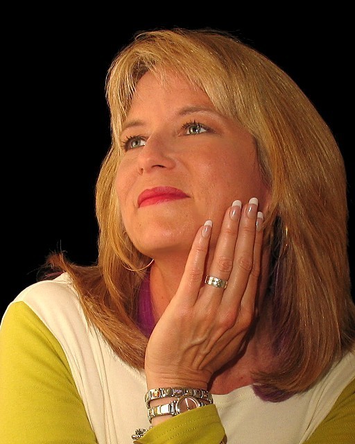
Black Velvet background, (2) 150W spots one above left other below right, 420EX Speedlite (0 FEC, First Curtain Sync) bounced off white wall to the model's left. From Tripod.
Crop and resize.
Statistics
Place: 40 out of 92 Avg (all users): 5.7143 Avg (commenters): 6.5385 Avg (participants): 5.2000 Avg (non-participants): 5.9075 Views since voting: 1311 Views during voting: 357 Votes: 238 Comments: 26 Favorites: 0
This is a classic pose and her expression is almost perfect. Her chin is tilted just a bit high, could bring it down just a bi so we aren't looking up her nose so much ;)t. Also the lighting seems rather flat, leaving her skin with a dull look. And it looks like there is purple on her hair or neck on the left? Not sure where that came from. A 5
Lighting: Well done, with perfectly expressive catchlights.
Pose: The pose is well done, but I think tilting her head toward the camera and then moving the camera up to just above eye level would have been more expressive without the foreshortening.
Background: The solid black is well done, but a lighter color would have conveyed 'pleasant' more clearly.
Beatiful lady in a simple elegant pose, nicely light. Not much you can do to improve on this! The only thing I find distracting is the purplish object between her hair and rist in the center of the shot. Is it the color of her shirt? A shirt underneath?
TC
Natural looking pose and expression on your model and I like your angle of view. Colors and skin tones good too. Black background really make your model stand out. Well done.
I think in a portrait the eyes should be a center of focus. Her eyes are nice and bright with good catch light but they are they same brightness as her finger tips, Well, it is a nice french manicure but unless she was the manicurist or particularly values her hands, I think the fingernails command too much importance. The best light falls on her hand also and the jewelry is ver interesting, That leaves her face with a secondary importance. What about cropping just below her knuckles, that looks more balanced to me and makes her lovely face stand out. I do like the way you have left more space on the left, leaving room for her gaze to be part of the picture. Maybe the white balance is too pink?
She's a very pretty woman. Looks over sharpened and her jewelry is reflecting a lot of light. Personally, I think I'd prefer her to be looking at the camera ... but I know this is a matter of opinion.
likes: nice pose good soft expression
dislikes: camera angle - from this angle my eye always goes to the nose
lighting seems to be just a bit harsh, if you are using strobes back them up about a foot that should help
Attractive lady. I think for her I would of liked a softer lighting and for sure a solid colored shirt. Over all a good shot and I hope you do well in the challenge. Good luck.







 Add photograph to your favorites
 Add photographer to your favorites


 Photographer found comment helpful.


