Hi, Critique Club here...
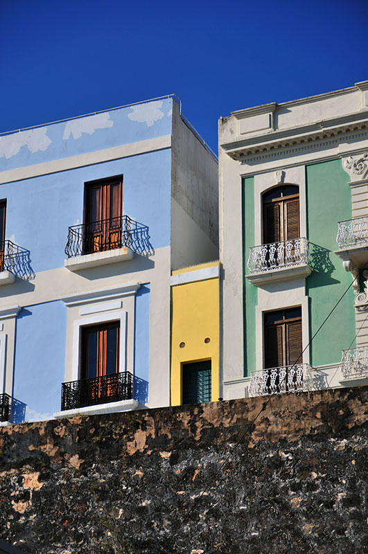
The colors are great in this image, I really like the buildings and how the colors work with one another and how they play off the terrific blue sky. The exposure is right on, and sharpness is right there as well.
A couple commenters talked about the lower third of the image being a distraction, and I agree. I think it might have made a full point difference in your score if it had been cropped 90% out. Maybe there was a reason why you didn't, but without knowing the scene it would seem to me that this would have been a better shot in landscape to show more of the great architecture rather than in portrait showing the wall.
Hopefully this was helpful. |





 Add photograph to your favorites
 Add photographer to your favorites


 Photographer found comment helpful.