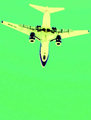
oooh dang, looks like it could be a great shot but very dark and very small, i am sure you are getting comments about using the full 800 pixel maximum allowed.
I think this could have been an excellent idea but you have a few critical errors. 1. This shot is far too dark, it is difficult to make any details out. 2. It is far too small. It is best to take advantage of the full 800 pixels allowed, especially on the width.
Nice use of vanishing point perspective to show the concept understood. The photo is pretty dark and only shows the lights which is somewhat uninteresting. Also there are size limits and it is a good general practice to max out the photo size when saving for the web. This one is too small.
Your entry is too small to see it in a descent way. That, combined with the the fact that it's too dark, makes that I just can't give a high(er) score than 3. Sorry.
Not only is the very small size probably hurting this shot, but it is quite dark, so I'm not sure what detail I am missing. Utilize as much of the file size allowable and it will help the viewer better see what you are trying to show us. :) Hope this is helpful!
This looks great. Very mysterious. The image is too small really to get a good look. Perhaps consider 700 or even the limit, 800, pixels on the long edge.







 Add photograph to your favorites
 Add photographer to your favorites


