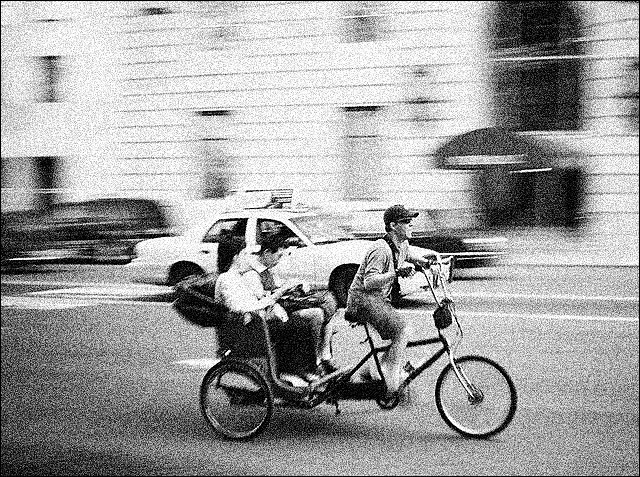
Wow, that's grainy.... I assume you did this so it'd look like it was in the paper? I think it might be a little over done if that's the case. If it's your camera delivering this much noise, I think you need a new one :-). I would have cropped out more of the top of the image, to focus on the cab and the pushbike chap. The large black window attracts my eye away from the main 'characters' in this image.
Having said all that, it's a much stronger match for the challenge than some of the more asthetically pleasing photos in this comp. Well done.
I know what you were going for here. Too grainy though...good effort!
Despite the graininess...good motion blur gives the picture energy.
Good headline matching photo well.
Excellent "classic" newpaper look and feel. Good use of shutter speed and grain. My only complaint is that it's so dead center, Crop of about 3/4 of the distance from the left edge and the whitish cab and you have a much stronger image. Oh - and get a better proof reader as " Fair" should be FARE! But then again - if you are imiitating modern newspapers - maybe that was intentional! Nice job.
Nice panning effect. A little less noise would've been easier on the eyes and I don't remember the last time i saw an image that grainy in newsprint. Good effort though.
I like the motion blur in this shot. The subject, composition go well with your headline. I'm just not sure that the grain works for me. I don't believe it would work for a newspaper editor.
You know, I honestly think that the grain here detracts from the photo instead of enhancing it, I think it would have looked better without it. But the panning is perfect and it is definitely newsworthy, so i'll give you a 9 because i'm imagining it without the grain.





 Add photograph to your favorites
 Add photographer to your favorites


 Photographer found comment helpful.


