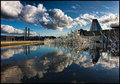
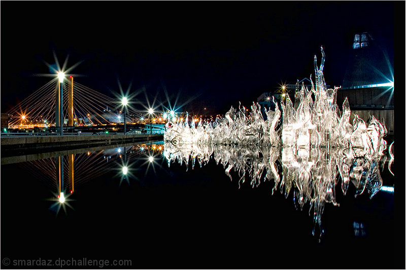
Around the backside of the Tacoma Museum of Glass is a reflecting pool. From time to time they feature installations in this pool. I do not know if this was created by Dale Chihuly or not.In the background is the Tacoma Dome and the 705 bridge.
I pulled the raw into Lightroom and adjusted the w/b and slightly on the exposure. In PS I made a 3 pass USM, ran Topaz Adjust contrast preset, cropped,bordered and saved for web.
Coincidentally, I featured the Tacoma Museum of Glass in the Perspective 5 challenge, which at the time netted me a personal best:
[thumb]624587[/thumb]
We'll see if this follows suit.....
[Feb. 11th, 2010 02:58:35 PM]
I was expecting a higher score on this but I think some may see it as not in the spirit of the challenge but my camera was sitting on the edge of the pool it would not be the normal viewpoint when standing there
Statistics
Place: 33 out of 163 Avg (all users): 6.1443 Avg (commenters): 7.0000 Avg (participants): 5.7619 Avg (non-participants): 6.3282 Views since voting: 1367 Views during voting: 333 Votes: 194 Comments: 15 Favorites: 0
I like a lot of things about this image. I like the richness of the blacks, The direction of the glass sculpture and the leading lines of the row of lights. Problem is though that I'm not sure I like them all in the same photograph. To me, there are a lot of elements competing for attention. It's hard for me to follow the sculpture into the picture and not be distracted by the bright lights and lines on the left. Same with the single bright light on the right.
There are a couple issues that stand out for me.
1) as already mentioned, too many strong elements competing with one another.
2) the subject, the glass sculpture, is devoid of detail in some areas. I realize shooting glass is difficult, but since you chose it as your subject matter...
3) the composition could be a little tighter. I played a bit by moving this around on my monitor to see if I could find a stronger composition and I found that (to me) it was stronger if I cropped from the right to the edge of the sculpture to eliminate the bar and the majority of the light on that side. From the bottom just past the blue reflection, which to me is a distraction. From the left just past the first yellow/orange light. That was just to move the end of the glass sculpture a little more off center. The result of the crops above would result in more of a pano crop but I don't think that's bad. Of course the cropping is all artistic vision so I'm just presenting you with something to think about, not what's right or wrong.
Once again, I like the image but these are my opinions about what would make it better for me.
Nice location, but a bit busy in some places and very empty in others. Very nice color, and you placed the main elements well. Sweet stars on the lights.
ETA: Why is there a black band on the right? I don't remember that being there before...
yeah i saw that half way thru voting, dont know how i did that, something screwy when i was editing it
Nice location, but a bit busy in some places and very empty in others. Very nice color, and you placed the main elements well. Sweet stars on the lights.
ETA: Why is there a black band on the right? I don't remember that being there before...
Great reflection shot. Would have liked to see the left side cropped a little tighter. The black bar looks like you have placed a border on that side only, and is a little distracting to me. Top capture all the same.





 Add photograph to your favorites
 Add photographer to your favorites

 Photographer found comment helpful.


