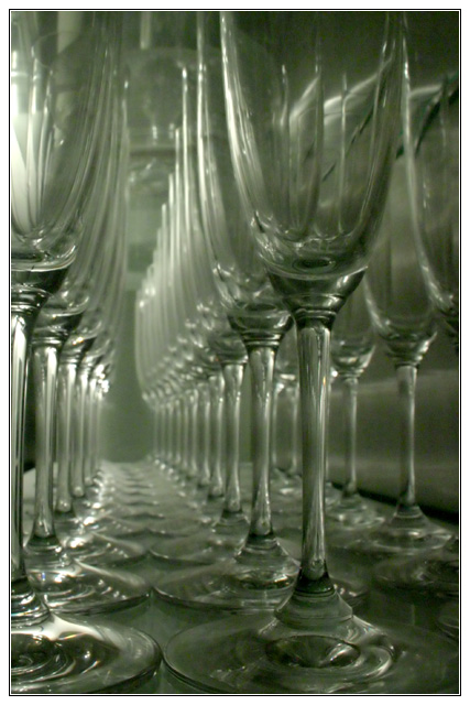
Looks a bit soft, a little USM would help sharpen the front glass. Also I'm not really keen on the green colouring. I think adding a little more contrast would also help the image stand out more with greater impact.
A very graphic image with nice lines and repeating shapes. Print is rather muddy though with no real "black blacks" or "white whites". And the border draws attention to the lack of whites as it's the brighest area of the scene. The title/headline does make it a news story on a slow news day.
This is a cool arrangement, giving a deeper perspective than usual. I wish that the focus was sharper and that something would stand out to get my attention. Just a sharper focus and contrast might provide that. It doesn't honestly seem to be a journalistic photo, but I think this challenge is very open to debate and opinion, so I am not basing my scores on that heavily.






 Add photograph to your favorites
 Add photographer to your favorites


 Photographer found comment helpful.


