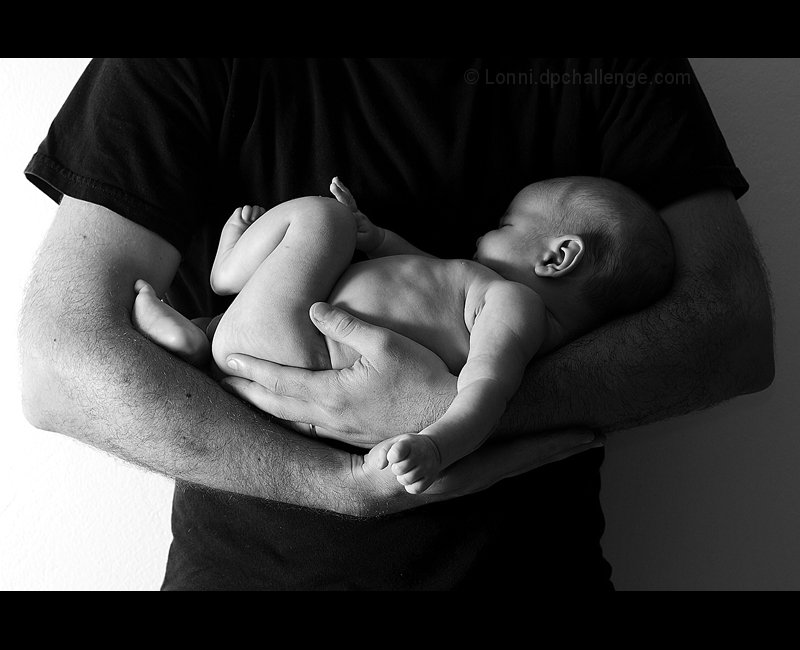
Well this is the third image in a row that I have submitted of my son in black and white. It's probably getting a bit tiring to all, but I'm taking to opportunity to get a few nice newborn shots of him while he's little.
I am really not very happy with this one with only basic editing. Black and Whites really benefit from dodging and burning, and this shot really needs it, but oh well.
Score prediction: 5.9 - maybe optimistic because people will think it's a shoehorn if they haven't thought about the Einstein quote.
Editing was just levels, curves, convert to B& W with channel mixer, crop, adamus sharpening, add border, SFW
[Feb. 16th, 2010 11:30:39 PM]
This image is far from perfect, and there have been some great comments about how I could have improved it.
Lisa (Iamwoman's suggestion about the lighting position was good, as are the multiple other comments on the lighting. abuscemi's suggestion about my husband being better shirtless was particularly popular with him, but Pete's on a diet at the moment, and his beer belly (not actually from beer) would have detracted :) He's actually lost 6.5 kilos (14 pounds) in the last 6 weeks, and when he loses the remaining 9 kilos maybe I'll try a shirtless version :)
paynekj's comment is interesting. I somehow felt though that by leaving him faceless the image might connect with people as an idea/concept rather than a portrait of a particular father/son. Maybe I'm wrong.
I can't help thinking that by not including the father's face you have produced an image that's contradicting your title. In fact by adding the wide border at the top you are positively excluding the father in my opinion. Which I find to be a big pity because the quality of what's visible is undeniable.
Lovelye moment - black and white works well. I think the lighting would have been better in reverse. I'd have liked the head lit and the bottom not so much.





 Add photograph to your favorites
 Add photographer to your favorites


 Photographer found comment helpful.


