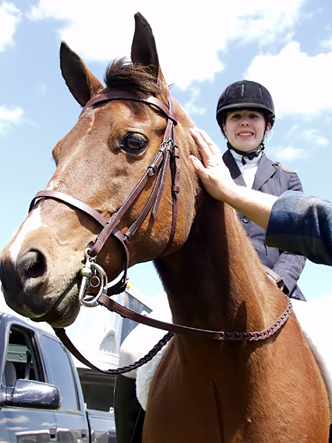
A charity horse show held during the week of this challenge provided me with ideas for submissions. My daughter is the rider and took several blue ribbons with her Quarter Horse "Tin Tanker".
Statistics
Place: 73 out of 232 Avg (all users): 5.4813 Avg (commenters): 5.9474 Avg (participants): 5.2500 Avg (non-participants): 5.6190 Views since voting: 1605 Views during voting: 330 Votes: 268 Comments: 19 Favorites: 1 (view)
Great composition, color, and title. Seems a tiny bit too tight on the left, but this is so good I doubt it'll affect your score from others. Good luck.
Really good shot. Just a nitpick: I wish the tip of the horses nose wasn't cut off, but I know how hard it is to get animals to cooperate. Nice headline too.
Just a few nitpicks: I wish the horse's snout wasn't touching the border, the truck in the background is distracting as is the petting hand. Other than those, beautiful horse, lovely rider with a nice smile, and excellent sky. Good one!
Your composition ,subject ,angle of shot title are all very good and meet the challenge perfectly. What is wrong ,well it is a little overexposed(look at the sky),the hand on the horse should not be there. For these reasons I scored it down and gave you a 6.
I could buy a caption like "Charity Horse Show at the Fair" but if this is the "Grand Champion" where is the ribbon, trophy, award that shows this as the champion. Your title should match the photo. This photo mostly works, but I'd like to NOT see the guys hand from right and also lose the pickup and trailer in the lower left. The angle, clouds, general framing other than that works great.
This goes in order of what I notice first:
1) Random limb! Eeek, that's bad... and the tip of the horses nose is cut off...
2) Great great idea.
3) Try some contrast to add some deeper color to the horse and it's rider, it seems too pale.
4) Great expressions on both horse and rider, if the arm weren't there and the color were a bit better, this would be scoring higher, but sadly it hurts it.
Score: 7
If it weren't for the the truck and horse trailer, this would have a lot of potential. But given it is supposed to be in a newspaper, I find it a bit distracting. =]
Really nice photo. I think it would probably be better with a bit more saturation and without the hand and the truck in the background, but I know you probably didn't have much control over where the horse was standing. But this is a really good shot as it is - nice job!





 Add photograph to your favorites
 Add photographer to your favorites


 Photographer found comment helpful.


