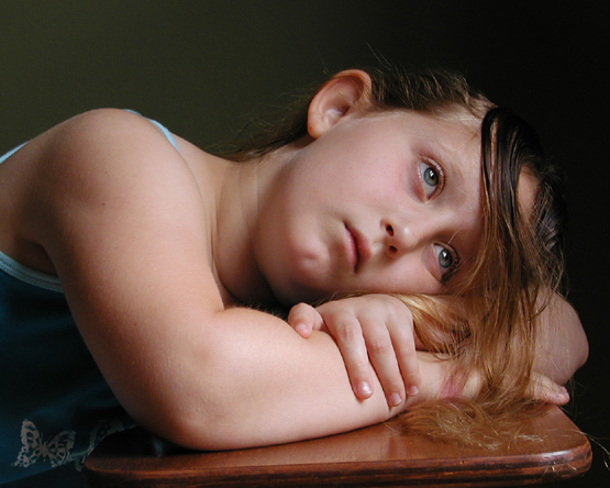
Used PS color balance to remove a small spot on right arm. I just noticed it, and it is in all my shots now! something in my camera. I fear my beloved UZI is beginning to fail me.
ALl natural light, about 5:30pm, after a rain storm.
Statistics
Place: 49 out of 92 Avg (all users): 5.5362 Avg (commenters): 6.0000 Avg (participants): 5.3438 Avg (non-participants): 5.6082 Views since voting: 1238 Views during voting: 385 Votes: 235 Comments: 29 Favorites: 1 (view)
from the critique club:
Here you did all the right things to produce a beautiful image. And the colors, well, they are jusr great. They have that old classic oil paintings look. The background is ideal, it is as if the subject emerges out the dark. The composition is superb, you have this beautiful model looking like a cherub. The only thing I would have different is to have used a simple gown, but hey, competition is over and you can clone out the figure on the gown. Since you are getting such good color from your camera, I would have it checked. I will not comment on the magenta color on the wrist.
You will get many different opinions about the hair. The viewer falls in love with pose and the colors and then focuses on the subjects eyes. It is then that the hair comes into question. Well, you did exceptionally well, you captured the old flavor and you seem to have talent to spare. I am not one to send anyone to revisit a picture, but this idea should be redone to give you a masterpiece for your port.
Thanks to everyone for their comments. This was my first challenge, and I have to say I am already learning from the experience and from the comments received.
I am going to reshoot this picture (of my daughter, who is 8 by the way) trying to take into account many of the suggestions given. While not new to photography in general, I am new to really taking it seriously, and I'm hoping participating in these challenges and interacting with members of this website will improve my skills.
A very classic pose on the desk, well done. Now for the nitpicking, the hair across her forehead is very distracting and adds nothing to the shot for me. Covering her hands like that is a big no=no in studio photography. Also the lighting seems just a bit harsh, just a tad more shading, looks like natural light? And a slightly tighter crop on the left, taking the shirt out of the picture, it also ends up being a bit of a distraction, taking away from the girl's beautiful face. A 5
Lighting: The lightin is good, with the exception of the lack of separation between the hair and the background
Pose: Sorry, but the model looks seriously depressed, not the most flattering for a portrait. The focus is on the elbow, and is not as sharp as it could have been once it gets to the face and ear.
Background: Works well with the tone of the image.
the leading arm towards the camera makes it look much heavier than it probably is. Not convinced that the hair position helps her either - particularly as it dissappears in to the background and appears on the table too - looks like some of it has almost been cut off and ended up lying on the table - some better arrangement might have been more flattering
A very delicate study and expertly photographed. Being that it exudes that traditional looks, like the early paintings I would have prefered a simple gown without the drawings.
What a sad expression...makes you want to hug or console. Effective use of lighting. I would have preferred the swatch of hair to be pulled back, but that's just me. Good effort. :o)
First - your title needs to be changed. perhaps English isn't your first language. The dictionary definiton of ponderous is 1 : of very great weight 2 : unwieldy or clumsy because of weight and size
3 : oppressively or unpleasantly dull. An elephant might be ponderous but I think you meant thoughtful.
Second, the picture is wonderful. (actually it does have some weight of sadness to it) The lighting is perfect, the mood is so strong, ugh- to be a teenager again, no thanks.
Awesome pose and beatiful shot of a lovely young lady! I like how you have the lighting here. You have great sense of depth, while maintaining the lovely pale creamy white skin without blowing it out. Great catch light in the eyes. Only real distraction is the butterflies on her shirt. A different outfit (or a little cloning) and this would be the bomb!
TC
The chair surface seems to take away from the wistfulness of the portrait...might it have been a less intense surface? I like the lighting and the way the girl fills the frame. 9
I like the expression and pose. I would like it better if the table or level, or not shown. Image seems a bit small (555 pixels, when it could be a 640), buy it capture the confusion of youth well. Nice job.







 Add photograph to your favorites
 Add photographer to your favorites

 Photographer found comment helpful.


