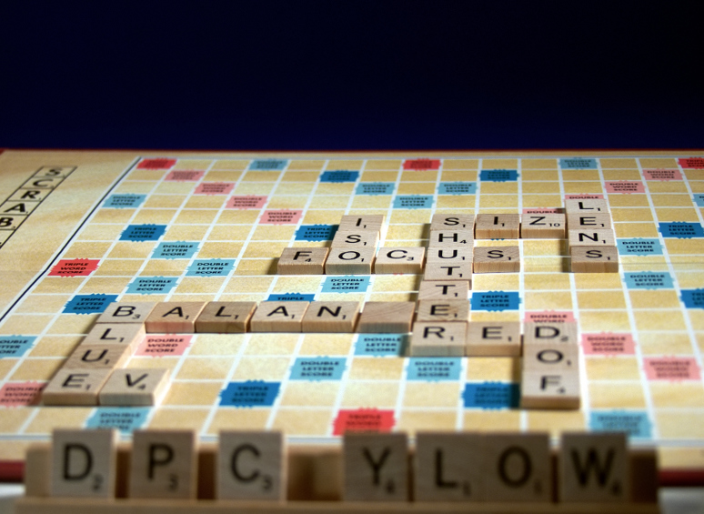
Thought everyone would get a chuckle out of this one. Lit with super-awesome clamp light from Wally World with poster board backdrop from same. Cost me all of 10 bucks.
Enjoy.
Opened with UFRaw and used auto white balance. From there sent to Gimp.
Figure I'll get knocked for the crop job(a little too tight), oof on the foreground, and composition. Hoping for 5's or better, just for hitting the subject matter.
We'll see...
Statistics
Place: 28 out of 82 Avg (all users): 5.4771 Avg (commenters): 6.3333 Avg (participants): 5.3913 Avg (non-participants): 5.5000 Views since voting: 967 Views during voting: 348 Votes: 218 Comments: 9 Favorites: 0
I grinned when I saw this shot, am a fan of humour and creativity esecially when you really only have desklamps and bristol board to work with. Love to see the amount of work and care put into inserting photography terms into the shots, and the DPC Y LOW is great!
The black at the top is extraneous and just draws the eye back to there, to where there is nothing to see. Cropping it down to just a bare minimum would have helped tremendously. Your shutter speed could have been slowed down and the aperture closed down, too, and added tremendous dof, if a tripod had been handy.
So artistically, what you want to capture is fine, but in shots where it is difficult to tell a story, you want to give a sense of mood. The flatness of the bg and strong lighting both draw attention to themselves and less to the words on the board.
Hope this helps, feel free to PM me with any questions,
Good photo. The black space at the top is unecessary. I think yuou should have filled the frame with the board. Possibly a different camera angle or position the board on a slight angle to do that.





 Add photograph to your favorites
 Add photographer to your favorites

 Photographer found comment helpful.


