Author Thread Comments Made During the Challenge
Post actions
Eye catching processing. Needs to be a little sharper.
Post actions
I think the colors are a bit distracting. Too bright for me.
Post actions
This image does have perspective but the crop and the unnatural colors spoil it completely. 4
Post actions
This is surely a brown attempt but clearly you failed because I liked it and I'm giving it 7*.
Post actions
blurry, weird PP colors and lack of using the full size for submission takes away from this
Post actions
Ow ow ow ow. Sorry but crazy, eye-hurting pp will not save a poor shot. Trust me.
Post actions
Well this one is most def memorable. Obviously you intended for the colors to be like this but Im just not a fan. Great job being different though, I just seem to be missing the point. Good luck.
Post actions
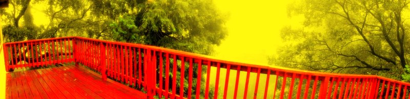
Colors are way oversaturated. The panoramic composition is not working for me either, sorry.
Post actions
hmmmm, this processing is just not doing for me, way too much yellow imo
Post actions
Wow - this is crazy! I'm digging the colours, the more I look at it the morre I like it. Shame about the crop, although again I think that's part of its crazy charm.
Post actions
the colors here don't work for me
Post actions
Strange PP, the yellow is not really attractive ...
Post actions
What's with the pp? Not my taste unfortunately.






 Add photograph to your favorites
 Add photographer to your favorites


