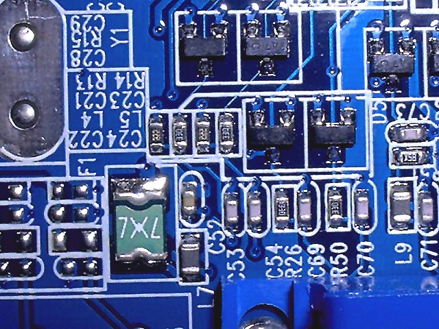
Appears to be upside down. Blue is my favorite color but that's not enough to really bring my interest to this. It lacks a lot. Technically photo wise the focus is decent, subject meets challenge, composition lacks interest, and crop is up to the individual on this one. Just doesn't grab a person. Sorry PTL but decent shot.
This certainly meets the challenge and the color is good. The perspective makes the picture appear flat though. Side lighting would show some dimension, with light and shadows. 5 Good luck in the challenge! Grayce
This appears to not have been taken very sharp and sharpened in PS. That might not be all true, but the effect is the same. It makes the picture look sort of fuzzy and sort of fake, when obviously it isn't fake. Blue makes for a nice background on here and the lighting is good. - Inspzil
In the 'technology' challenge, I expected to see a lot of photos of circuit boards. Knowing this, I believe that these photos need to be done more creatively in an attempt to make them stand out. How could you have made this photograph more impactive? If you are new to the challenge concept, one thing you may consider is ASSUMING that there will be several other photos like yours each week. In many cases, there are! With this in mind, you need to create impact.... - setzler
This is a nice close shot - but it feels upside down to me - most of the horizontal writing is upside down. I'd also prefer the white lines to be true to the horizontal and vertical edges of the frame. Good colour and light. 6, Kavey Kavey





 Add photograph to your favorites
 Add photographer to your favorites


