I guess we share the same opinion on this one then Zig...because I absolutely love the point of focus on this one. If the girl was moving, I'll give you serious bonus points for nailing the comp and focus point!
Originally posted by Zigomar:
Originally posted by Jac:
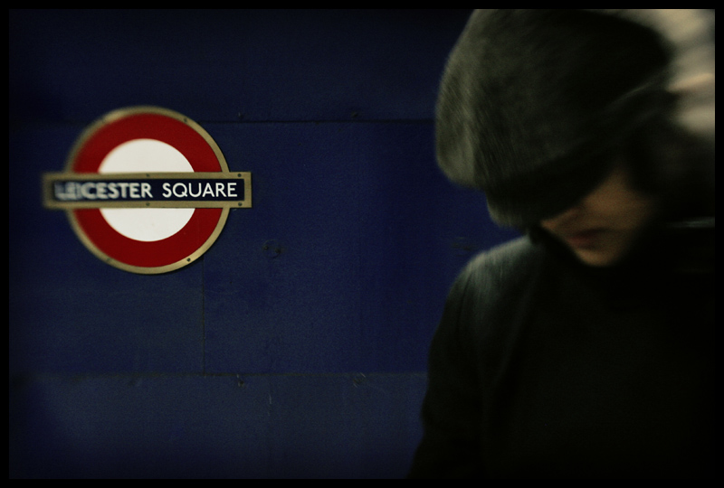
I like it although I would have liked to see more blur on the sign making it less dominant.
I disagree, I think that Lensbaby photos need to have a sharp spot, that makes blur work better. Some sort of initial juxtaposition (focus-blur) is needed, and then the other compositional elements of the photo take place. Just my opinion.
I like it although I would have liked to see more blur on the sign making it less dominant.
I disagree, I think that Lensbaby photos need to have a sharp spot, that makes blur work better. Some sort of initial juxtaposition (focus-blur) is needed, and then the other compositional elements of the photo take place. Just my opinion.
To me, your style with the lensbaby is representative of the Mod revival trend of the 70's and 80's... Your shots seem to focus on young British or German working class folk and I enjoy your lensbaby work a lot!
This particular photo feels like an album cover for The Smiths or maybe a scene from Quadrophenia or something. Anyway great job! I'm a fan!
Amazing shot. I love the contrast between the greyness of the passerby and the wall and sign. Makes me miss London quite a lot. I lived there for 15 years up until 18months ago.
I love this one. I particularly like the way you caught the sharp spot on part of the sign and the blue color of the subway wall coupled with the figure so close to you on the right. I like the fact that we can't see the eyes. Nothing but perfect!
I like it although I would have liked to see more blur on the sign making it less dominant.
I like it -- it looks like an urban UFO. We are left to wonder what the relationship is between the UFO and the person in the foreground. Is he just walking into the wind or is he a POW of an intergalactic war.




 Add photograph to your favorites
 Add photographer to your favorites

 Photographer found comment helpful.


