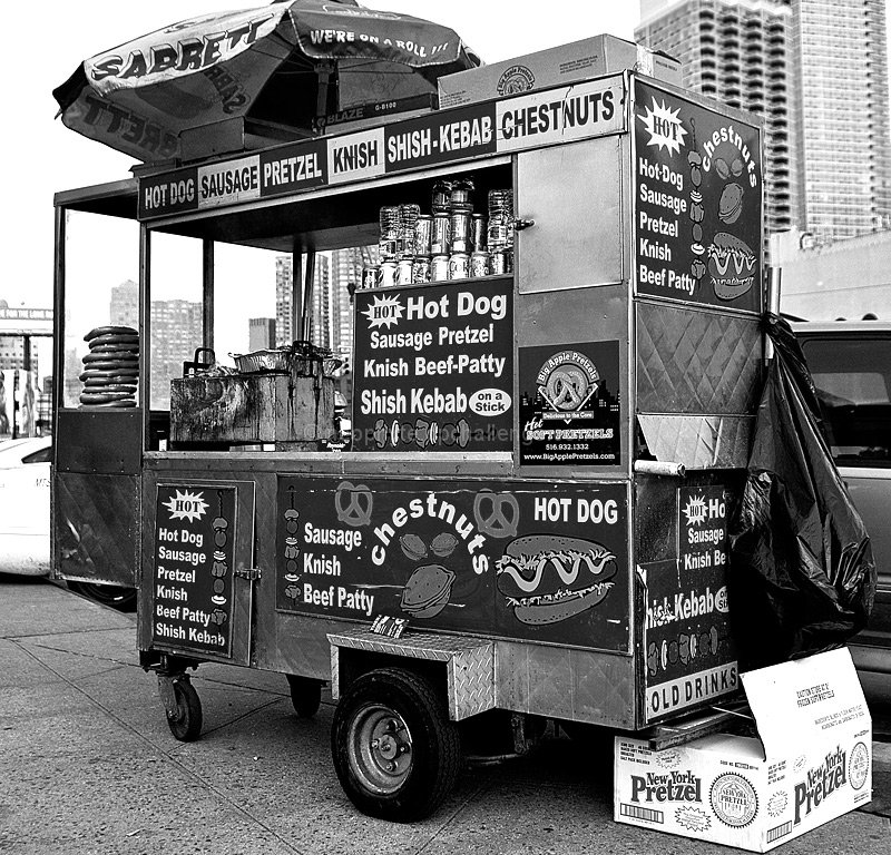
I'm going through the entries, stopping at those images I feel have had the benefit of an unconventional eye and dwelling a little longer to try to see and appreciate what you saw. This is one of those images.
Positives: I like the aspect ratio, it gives the hotdog stand an upright feel and we feel close to it. I also like the angle at which you have captured your subject. I think the black and white works well, though I feel you could have made it a little edgier with higher contrast and added grain.
Critical stuff: Although the composition demonstrates a lot of care (I think you may have even corrected for perspective) the cropped umbrella stands out a little. Above, I said this could be edgier - the sauce vat (or what ever you call it) seems to cry out for a bit of added emphasis; I'm not sure what editing tools you have access to but a tonal contrast brush or something similar over that area might have been really effective. As I said above, I might have tried some grain, some harsher contrast and perhaps a small vignette - however, you may not have the editing tools, nor might that sort of image be to your taste. When I do it, I do get pulled up for 'noise'.
Overall: An effective image but one where I think that the subject and the edit aren't as complementary as they might be. |





 Add photograph to your favorites
 Add photographer to your favorites


 Photographer found comment helpful.


