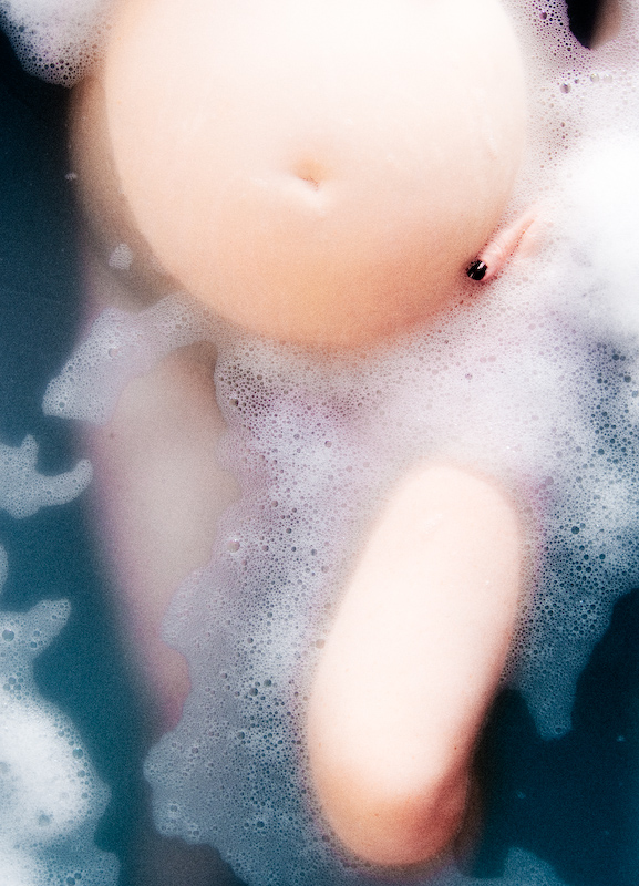
My partner Sarah and our little one. This is the second take of this shot. The first was far rougher and had a sepia-like colouring. Although i like both, this one with the softer blue tones probably works better. I'm expecting some people to dislike the grain.
Statistics
Place: 51 out of 109 Avg (all users): 5.6705 Avg (commenters): 7.5000 Avg (participants): 5.5273 Avg (non-participants): 5.7373 Views since voting: 6223 Views during voting: 377 Votes: 173 Comments: 8 Favorites: 0
It's really great to be able to comment on one of your photos, you have a very unique style of photo that escapes from the trendy DPC-friendly world, it's very interesting to see your shots!
Regarding this photo:
Composition
The above water tummy and leg really balance the whole photo.
I probably would like to see another hand on the other side just to give a more comfortable feeling. The nail does not distract me, it adds a human touch.
Lighting / Technique
I was really hoping for some shadow, just to get a more perspective of dimension, it could really help to have some shadows on the right places, it would "un-flatten" a bit the shot (the tummy seems a bit at the same level as the water, and not so much rising out of it).
I like the grain in this, gives it a vintage look.
Processing
Great tones on the skin, and the blue is very soothing for this picture. Great deep contrast and colour.
Overall
A 7.5 score from commentators really means that your photo had an impact on an emotional as well as visual level.
All the best for you both (three in this case) :-)
If you have any questions feel free to contact me.
Regards,
Joao
Love the blue contrasting with the skin tones and the soft feel works perfect too. Almost looks like an abstract in the thumbnail. Which shows great control over shapes.






 Add photograph to your favorites
 Add photographer to your favorites

 Photographer found comment helpful.


