Thanks for all your comments. I was surprised to see 3 very similar images this week. I guess my idea wasn't as original as I had thought :o) I think I should have made the lighting a little stronger since a numer of people had difficulty distinguishing some of the detail.
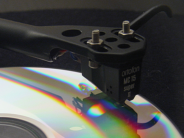
I'd have to disagree with the statement, but the picture is good. :-) I like the perspective, the colors, the contrast. The lighting is good, and causes the wonderful shadows. The idea is terrific, quite original, even though there are two similar in the challenge. Hey....."great minds think alike!" Good luck in the challenge. Grayce aka Gracious
Great composition. Only complaint would be that the CD looks a little plain - could do with more colour (but that's just me - I like my CD's with a lot of dramatic clour!)
I can't quite read above the MC 15 or 16 Super II. So I don't know what this is. I do know what it is as a photograph - it is good except too dark, especially in the top right hand corner. Can't see well enough to figure out what it is. Still a technically good photo, but part of the job is to tell you "I'm a........." Wish it had. PLT
This is toooo freaky - every week that I don't submit I always find at least one image that closely reflects an idea that I had. This however, is almost exactly the same as the image I had in my mind for this week - I didn't submit although I'm beggining to wish I had, can you imagine the comments :-) Anyhow, your image - well framed and composed, looks a touch fuzzy maybe - it appears that the main point of focus is the tone arm as it leaves the frame on the left, I would have prefered to see a touch more crispness in the stylus head. The reflection sits well and the colours in the CD work well. Biggest let down is the hair (or whatever it is) on the turn table mat to the right of the stylus: 7 -lamedos-





 Add photograph to your favorites
 Add photographer to your favorites


 Photographer found comment helpful.


