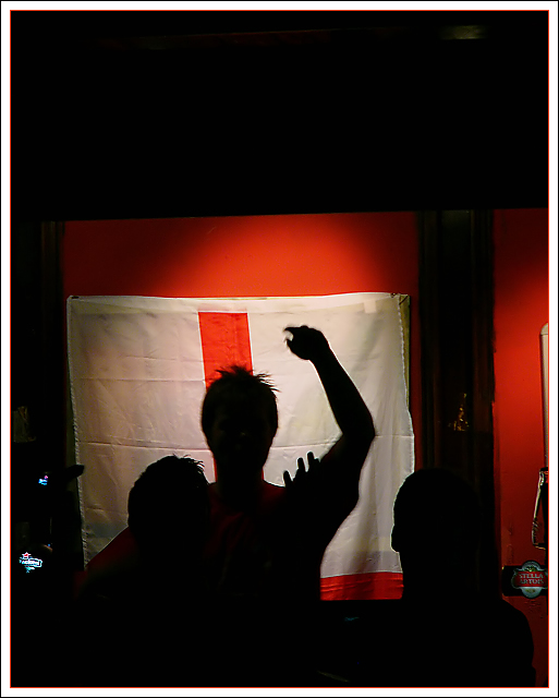
The colour and the exposure on the flag are good, however I get the feeling there is something missing. It could be the fact that the entire flag isn't visible or the fact that the person with their arm raised doesn't have much visible detail.
More details in the photo to identify with England I believe would make this a better image and portray the emotion that your title implies better.
Way too dark; I don't see the flag (if that's what it is) enough to know if that's the winner's flag or the loser's flag, I don't think the siloutette works well in this context, and there's too much negative space at the top. I would suggest lighting the subjects so we can see their facial expressions...
Great silhouette and a strong graphic image. It's too bad the guy on the left was there - it would be stronger with just the "main" subject. Definitely a news story - and full of emotion. Simple and understated title / headline.
A little dark, and not close enough. You don't need the dark space above and below. If you had gotten a closed fist in front of the flag - that would have been more powerful.
Can't see what's going on. Photo would never work for a sports(?) page. You need to get their faces if they are watching the game in a bar or what have you. If at the game some of the action is required. If I totally missed what you were going for in this photo, my apologies.







 Add photograph to your favorites
 Add photographer to your favorites

 Photographer found comment helpful.


