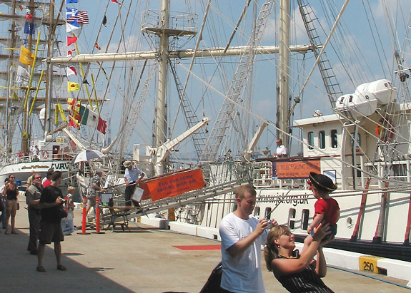
it looks like there's not much for composition here. I like the people in the foreground, but it is disturbing that their legs are cut off. I would have made them the focus of the picture. Also the picture is very pale.
Good headline. OK photo. A little too caotic for my tastes. I'd recommend cropping out the shadow area to make it uniformly lit. I'm also thinking the people near the red sign in the middle would've made a great crop.





 Add photograph to your favorites
 Add photographer to your favorites


 Photographer found comment helpful.


