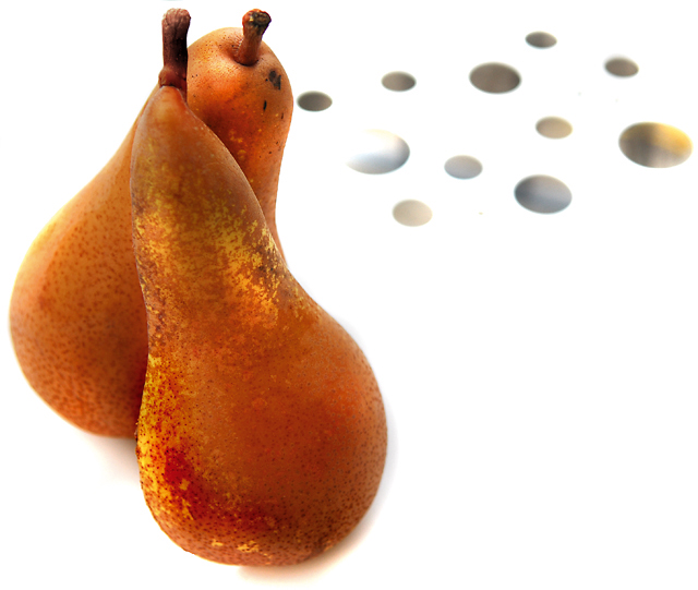
First impressions are that the shot is nice and crisp with some intrigue. Once I view for longer I start to see the issues.
Technically the composition is good but it's those dot things that balance the shot. The pears are a little too close to the left edge. The lighting is good in that is has the pears against a crisp white background but this is a double-edged sword in that it also makes the shot seem a bit sterile.
Artistically those dot things confuse us viewers. How do they relate to the fruit? Is this an "artistic" element?
In summary this has some really good points but I think the average voters was confused by those dots and the sterile feel.






 Add photograph to your favorites
 Add photographer to your favorites

 Photographer found comment helpful.


