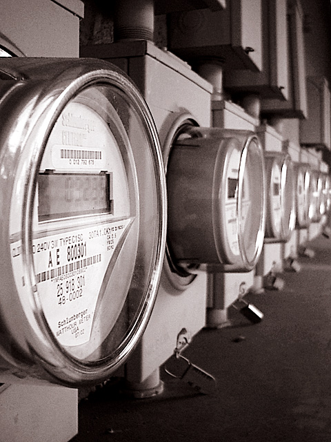
I like this composition-the pattern of the meters going in to the background--your focus s spot on and you have turned a dull subject into a work of art andrewm
I really like the way that the eye is drawn from the left and up to the right. The depth of field works well for me, but the color seems a little bland on this end. Of course, meters, though extremely useful, are usually jumping with color either. karmat
Looks like a familiar shot. The angle makes this picture. I also like the way the first meter is centered vertically and then they run off into infinity. Nice Shot G - Inspzil
I just happened to have stumbled across your original shot of this in your portfolio the other day. I really like it a lot better -- this one seems blurrier? Maybe that's the difference.
Is this the same image, except for the formatting, that is also found on your PBase site? I appreciate that the perspective is slightly different, but the lighting looks identical and appears to be shot during the same session. I prefer the image on the PBase site as it is much more dimensional. I am just curious. Morgan
good compo, classic receding repetition, i like the in focus foreground and the diagonal progression. the subject itself doesn't carry a lot of emotional impact for me. maybe if u had used the title to tie it into the price we all pay for our techo-consumerism or something? 7. mag99
Perfect !!!!! Everything that makes up a great photo is here. Color, leading line, thirds, clairty, lighting, and most of all....so very pleasing to the eye. Congrats on a great photo ! = 10 Shiiizzzam
Should have used something to difuse the light off the first meter. This is a dificult shot.with the light available. Focus is important. Hmmm. Truly I give it a 4.5 Work with the f-numbers if you can. :-)






 Add photograph to your favorites
 Add photographer to your favorites


