Entered at submission: N/A
(in other words, no time to type anything!)
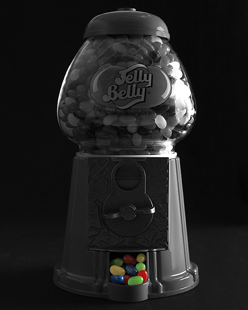
Entered after voting ended: My first-ever attempt at "selective desaturation".
This was a total last minute entry. (And when I say "last minute", I mean it. EXIF date/time on this shot is 23:37:21. I hit "Submit" at 23:59:50 and hoped it would upload in time!)
I had no idea how difficult it would be to light this Jelly Belly dispenser. The spherical shape reflected everything. What a nightmare...
I really wanted the "exposed" jelly beans to be much more vivid, but I just couldn't get the lighting right and I was running really short on time. So I downloaded the images I took, picked one, desaturated it and submitted it anyway -- with about 5 seconds to spare.
And in my haste I forgot to convert from AdobeRGB to sRGB before doing a "Save for Web", making the colors luke even more muted. D'oh!!
Statistics
Place: 10 out of 227 Avg (all users): 6.4433 Avg (commenters): 7.0952 Avg (participants): 6.4219 Avg (non-participants): 6.4800 Views since voting: 2472 Votes: 203 Comments: 25 Favorites: 1 (view)
Well darn it, not only a fine picture, but your post-shot comments helped me figure out I could edit that field after the challenge was over. D'oh, indeed :)
I usually just add further comments in the thread.
My hat is off to you for a first-ever attempt, no wait, it was an effect job of selective desauration, not an attempt. This was a stunning shot and so well-suited to the challenge.
I'm loving this shot. My only wish were that it were a bit lighter in the front. Focus and clarity are supurb! Nice crisp lines. The centered placement is good for your subject in this case. I don't mind it at all. The selective color is perfect, and it has overall appeal to me. My only complaint is the darkness in the front. Wish I could see more there. Otherwise, wonderful! ~Heather~
Great use of the desaturation to emphasize the subject and title. The dark background works well too. As a thought, maybe the spilled jelly beans could have taken more of the compostion by placing some on the table and cropping further back? Nice shot nonetheless.... 7
great idea. I would have liked to have seen brighter lighting overall. the colored beans at the bottom are a bit muddy looking. also there is a harsh hot spot on the right of the glass
I can`t understand why so many people dislike this technique..here is a perfect example of a picture being improved and made more interesting through partial desat.
Good choice of subject
Nice idea, and the colors sand out. IMHO there's too mcuh black and white relative to color, and the contrast in the B&W is too high for my taste - areas that black out completely vs. hot spots.





 Add photograph to your favorites
 Add photographer to your favorites

 Photographer found comment helpful.


