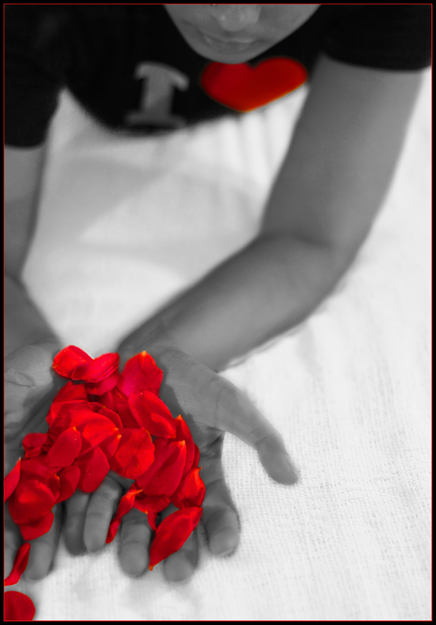
I rated this image fairly high in the challenge. There's a lot to like. For the sake of balance I'll look for "what might make it better" but the image stands strong as is.
I agree with another of your commenters that the composition is the strength here. Many aspects serve to strengthen - the contrasty b&w, the red petals spilling out of the frame balanced by the subject's face spilling out at the top. The odd glowing red of the petals, arms, and hands contrasts nicely with the "standard" look of the torso and chin. I never met a diagonal I didn't like (to quote a fellow-dpcer)
For the red-heart... I see that it helps pull my eye thru the composition (the face would do that on its own) and ties into the meaning of the petals. Would the shot be better without it colored? I don't think so. Is it much better with it? No. The "I" is more distracting because it clicks me into reading instead of feeling.
On the tight cropping - I think it works in all but one area. The right arm could be a bit more in the frame. I really like the tension caused by the cropping at the bottom and top.
I hope this was helpful. Please pm me with any questions or comments.
Interesting concept although I find the heart on the t-shirt a bit distracting. It ties in nicely with the red theme but I think it would've done fine if it was desaturated as well. The red border looks fine on the bottom half of your image but looks a tad distracting going across the model's face. My $.02






 Add photograph to your favorites
 Add photographer to your favorites

 Photographer found comment helpful.


