GREETINGS FROM THE CRITIQUE CLUB
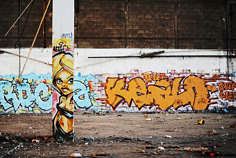
Another fun image from you. I enjoyed looking at it in all its detail.
You received a nice middling score on this image, and here I am to try to give you some impressions on how to (perhaps) make it better.
First, I wonder if zeroing in on the 'action' would make this more lively. There is a lot of scene-setting going on with the dark wall above the main subject. When I played around with your image on my own computer temporarily, I found that taking this down to just the foreground post and the orange-on-white background lettering make both more important graffiti features. then just a little touch of levels to give everything a pop and accent that foreground shadow gave this a new look.
But every viewer has different thoughts. The idea is to appeal to the voters quickly so your image doesn't get lost in the voting.
My suggestion would be to get lots of pictures from lots of angles, then experiment again and again to visualize the best presentation. you're already good at this.
Good luck in your next Challenge. I hope this critique was helpful in some small way.
Alice |





 Add photograph to your favorites
 Add photographer to your favorites

 Photographer found comment helpful.


