Greetings from the Critique Club.
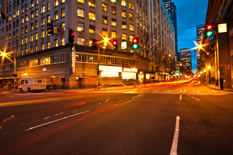
First impressions are the yellow colour cast (as I noted when voting).
Technically the colour cast could be sorted in post processing to a large degree with a levels adjustment. Composition is good but it appears a hard image to get all the buildings feeling vertical - the right most one feels off. The lights are bordering on over-exposure but the star forms they make are nice.
Artistically this is ok but I don't feel much from the shot. I think there is too much going on in it - the van, the light trails, the overhead lights, and the blown out sign right in the middle.
In summary this was a good location but overall the exposure was a little too long and the PP needed to go a bit further.
Feel free to PM me if you have any queries.
Gerry |





 Add photograph to your favorites
 Add photographer to your favorites


