Auto Adjusted brightness and Contrast
Duplicated the layer
Desaturated
Pulled out the color with the eraser tool
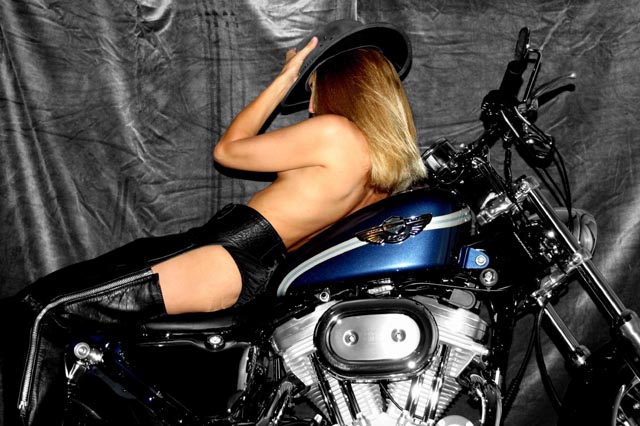
Color revealed, the womans skin and the blue in the Harley
Statistics
Place: 188 out of 227 Avg (all users): 4.6683 Avg (commenters): 5.4545 Avg (participants): 4.4240 Avg (non-participants): 5.0500 Views since voting: 2331 Votes: 205 Comments: 14 Favorites: 2 (view)
This photo doesn't seem much desaturated in anyplace. Nothing seems to be gained by the color versus grays. More of the motorcycle shown might make it more interesting.
On revisit - it's a well taken shot - just confusing with two main subjects. I would have chosen between the model and the motorcycle to desaturate. I think the whole thing in color with the model desat would have made a good composition or vice versa. The bike has too many greyscale colors to make a good desat object. Excellent workmanship isolating the color areas from the backgound. Great job.
The idea is good, but the background and lighting hurt the shot. The background is messy and the light is so that it creates very hard shadows. Use a second light behind the MC to get some backlight for your model and a fill light for your background. To make the background look less messy:
a) Use another background, or
b) Increase the distance between the MC and the background and use a wide aperture (like F2.8 or less) to let the shallow dof blur it into oblivion.
The model's pose makes it look like we are looking from the wrong side. This feeling is also enhance by the way the steer stands pointing away from the viewer.
hmmmm.... I don't know.... Woulda prefered, hmm, red? ::grin:: And borrowed chaps just never fit quite right...
::grin::
Damn nice bike, though!
(obviously meant in jest, folks... Actually, I think the focus is great and the skin tones are perfect. Unfortunately, I also think there's too much color for the theme, and because both the bike and the model were left colored, they end up fighting for attention. But it really is a damn nice bike! Cute chick, too! lol)
This has potential...but I do find the model's pose to be a bit forced and unnatural, like she is quite uncomfortable. It's also difficult to discern whether or not this is a post desat or simply a "desaturated" environment from the start. The background is too bright for my taste; a solid black without much detail would lend itself well to the subject. Softer lighting on the model's skin might also look better, or a pass through NeatImage. I'd also like to see the whole bike, or have it at a different angle. Of course, all of these are my opinions. :o)






 Add photograph to your favorites
 Add photographer to your favorites


 Photographer found comment helpful.


