Thanks for all the comments. I was on vacation and was using my laptop computer. I did not see the blue hue and oversaturation on the computer I was using. Too Bad!
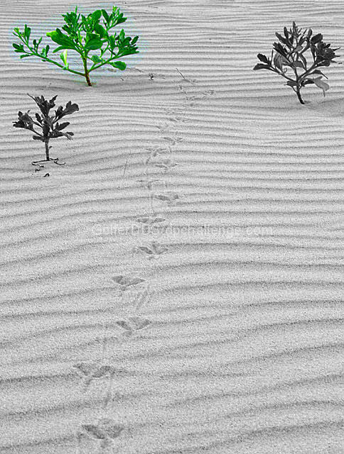
this picture would be a 10 if there wasnt that blue hue around the desaturated bush. that really ruins the picture. everything else just falls nicely into place.
Great composition, good subject. Only thing bothering me is the light green halo around the green tree. You should have selected the tree more carefully before the desaturation process, shame because it is a great shot.
Hmm. I like the subject and the composition of the shot, but the selective desaturation method you used isn't really working for me. I assume you did a rough selection intentionally, but I don't think it adds. I had been toying with the idea of a rough cut on the color for my entry but I couldn't get any pics to come out right. Would love to see this one done with a tight selection on maybe all three plants.
You started with a great image - the tracks in the sand are great, composition is very nice, DoF is perfect. But, having said that, the method you used to leave color on the one plant made a big mess of things. It appears way too saturated and has a bluish halo around it.
I feel so bad about the saturation problem on this shot. I love the sand, the layers, the footprints and the little trees. I'm sure you didn't see the pale blue background on your green tree before you submitted the shot - I have done that before where I thought everything was perfect, and it was, on my monitor, and then I was told about problems that were obvious to everybody else. Hey, at least you gave a real nice original photo, right?
something awry seems to have happened in the bush area, giving the coloured selection a blue halo. it's also unclear as to why that certain bush has been selected to remain in colour - did you perhaps consider keeping the footprints in the sand in colour? i do like the grainy feel of the image (such style is always welcome in my book) and the footprints are a lovely touch. 5.
Excellent idea, really like the ripples in the sand, extra points for including the birds claw marks.
Afraid though that you could have done a little more with the desaturation part. If you'd gone round the leaves etc in more details you wouldn't have been able to see the sand, it's too distracting I'm afraid. 6
Although I do like the idea, the composition, and the slight graininess of this, I really think you should have made a more accurate selection of the plant. More work, I know, but it would have made the impact of the one colored plant much better.
lovely focus, dof....and I really like the footprints and ripples in the sand. A good effort with the leaf colour, however to me there seems to be a slight pool of colour in the sand round the leaf.
This would probably have been a great B&W shot, but you seem to have added color rather than just subtracting, giving this a very unpolished look. The pixelated haze around the plant is distracting and the coloration is unnatural.









 Add photograph to your favorites
 Add photographer to your favorites


 Photographer found comment helpful.


