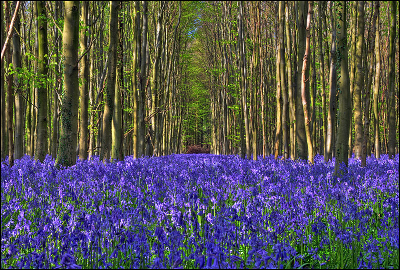
There is an explosion of lines/shapes and color here in this composition. While beautiful and verdant the tight bunching of so many lines and extra vibrant color makes it all the harder for the eye to drink in the scene. I am sure that a large size print of 16 x 20 it would look great large scale but when you translate it down to small scale it just hits the eye all at once and becomes overwhelming. One thing that bothers me is that the extra vibrant violet colors of the floral floor. It looks too saturated. While I see some wonderful shadows and midtones in the trunks of the trees to define each individual shape, I don't quite see the same mimicked in the flowers. It's there but not to the same degree - and I wonder if that selection was less saturated and had a boost in the shadows/midtones if it would ground and define the scene more.
Lovely composition and a beautifull setting - well seen. I like this as is but would love to also se this same scene with different lighting. Flowers in front a bit soft - maybe more depth needed there. 7






 Add photograph to your favorites
 Add photographer to your favorites


 Photographer found comment helpful.


