In response to all those who clearly struggled with this entry, as well as to those who articulated resentment or contested any worth or merit of this "kind of photography":
From Design and Composition: by Nathan Goldstein
Closed Shapes
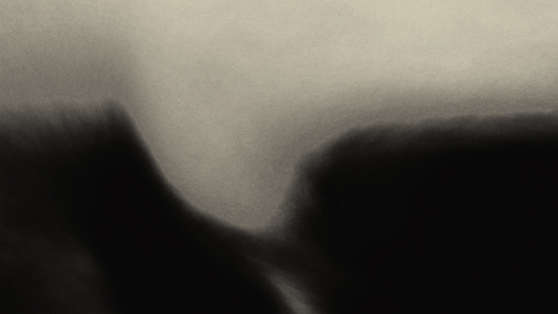
No matter what the style, the works of most artists show a preference for images either of a sharp-focused and edge-orientated kind, or of a less sharply focused and mass- and field-orientated kind.
The Art Historian Heinrich Wölfflin, in his book Principles of Art History, classifies a number of opposing characteristics that provide useful insights to visual qualities in image making. Among them are the contrasting qualities of "linear" versus "painterly" and "closed" versus "open" shapes.
Wölfflin points out that the linear and closed modes of presentation are given more to facts than to impressions, and to the fixed and explicit, rather than to the moving and metaphorical…
Open Shapes
Artists working in this usually more animated and sensual mode are attracted to the spirit, rather than to the letter of their subject's parts, to the fluid, not the fixed.
Their works show bold moving energies, which for all their contrasts, bring parts together, rather than the more sedate energies of the linear, closed shape mode that is more given to an overall union of clearly defined and somewhat more independently conceived parts. Or, to quote Wölfflin, the painterly approach, "aims at that movement which passes over the sum of things."
In this mode, symmetrical and front-facing arrangements are avoided, and illumination unifies as it bathes forms, as often obscuring as explaining them. Shapes do not enoy the relatively independent identity of the linear mode, but depend on eachother for meaning.
In Wölfflin's words, "as soon as the depreciation of line as boundary takes place, painterly possibilities set in. Then, it is as if at all points everything is enlivened by a mysterious movement"
Statistics
Place: 436 out of 445 Avg (all users): 4.4280 Avg (commenters): 5.5625 Avg (participants): 4.5464 Avg (non-participants): 3.9592 Views since voting: 1362 Views during voting: 414 Votes: 243 Comments: 43 Favorites: 6 (view)
I thought this was yours, Zeus, in light of some of your other recent challenge entries. I know abstracts don't please everyone but I'm a bit stymied by your super-low placement. If I can be literal about the image, my first impression was "wave" -- though later I imagined a first-person view from the back of a bird in flight. However, I'm sure you are more concerned with abstract qualities than "puzzle macro" images.
This looks rather like a charcoal illustration, so my only qualm would be that one might think it was a photo of an existing artwork -- something I seem to remember being said about another "controversial" artwork of yours (and an impression I didn't share, btw).
I think it's good for someone like me to know how to take the calendar-type images (before rejecting them), but I hope you keep doing what you are doing!
I don't really see a wave, I think I see a female body half submerged in dark water... maybe it's just me :). as I noted earlier, it has a great textural quality, makes me want to touch it. should look terrific in print.
I'll echo that, "seriously good". Got an 8 from me, and made me come back for several looks during the week. What particularly struck me is, which is the surface and which the ground, which is the wave and which is the substrate? I love ambiguity, I find it more and more in the simplest things as I age, though I've yet to find the courage (?) to attempt to render it.
I know some people will 'get' this better than I do. I am trying to look at this with an open mind but I don't think I am recognizing what is being portrayed here. I understand that this image is being entered into the 'best of 2009' so you are either looking for reaction from the folks who appreciate abstract art more than I do or you are just playing with us to get a reaction. Good luck either way.
There are those photographers that can record events as they happen. Those slightly better will capture the emotion that goes with the event. Still others can preserve joy, happiness, bliss without a human subject. The rarest of photographers can create an image that illustrates balance with despondency, angst and confusion. This image is the latter.
OR
you have a brand new camera and don't have clue how to work it.
I thought I was done commenting for this morning and was just browsing what I had coming up when I came across this.
I always find this sort of thing interesting. This particular one instantly made me think of Guinness :)
I like the form here, it does look very wave like, though it's hard to tell if that's actually what it is or not. For some reason I keep looking for details in this which I never find, I'm not sure exactly what I'm expecting to see.
Im unsure of what to make of this. Im sorry but I really cant give any comment that I believe that would help. Would love to know the thoughts behind this frame.
A different image in the challenge, showing your different style compared to the majority on this site. The wave is interesting and the use of B&W is good.







 Add photograph to your favorites
 Add photographer to your favorites

 Photographer found comment helpful.


