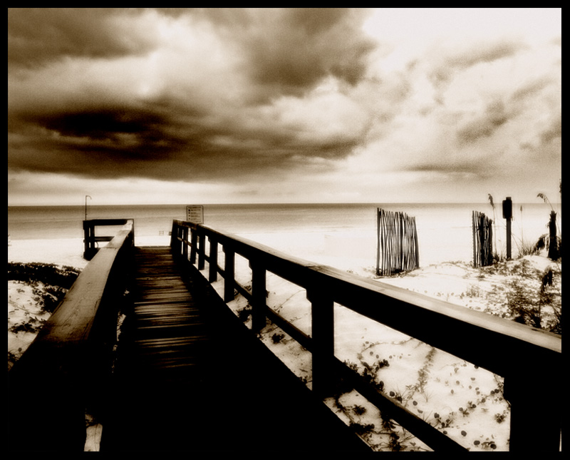
A nicely composed shot, great dof and there is a sense of place here, like the sepia...but to my eye the pp is very heavy-handed. Almost looks like you tried to turn the shot into a charcoal sketch. Interesting to see how the commenters see this shot as either a dark and foreboding scene, or as softly lit and pretty!
For a landscape (OK, seascape) your settings look quite high. F.6, fine...but an ISO of 400 and shutter speed of 250 seem better suited to capturing a squirmy child than a largely stationary scene. A tripod would have been a huge help here, as would have going down to your lowest ISO and going to a much, much slower shutter speed. Yes, that would have resulted in blur from scudding clouds and rollings waves...but the pier would have stayed in sharp contrast to both.
Overall, a decent shot, but you might want to think more about the shot and less about how to improve it in pp.
? With that border and the incredible contrast and noise, I'm guessing you are going for a brown here? Sorry but this just doesn't work for me, at all. Sorry, but a 3 from me today. (Sorry. )
This looks like an interesting scene, and I'm wondering what exactly you took this with to get this effect, or whether it was just editing.
I'm not sure whether or not I like the framing with the pier running off to the left. It sort of feels like you couldn't make up your mind whether to have it running completely off to the left or in centre so just chose middle ground.
you have such a nice picture here...but I'm not sure what you did HDR or just to much Dodge & Burn...I like the composition alot but the overly deep tones takes away from the picture for me...what a nice location
Good composition but too contrasty for my tastes. A lot of grain in the sky, looks like it was added in processing, not sure why. Horizon is also tilted to the left.







 Add photograph to your favorites
 Add photographer to your favorites


 Photographer found comment helpful.


