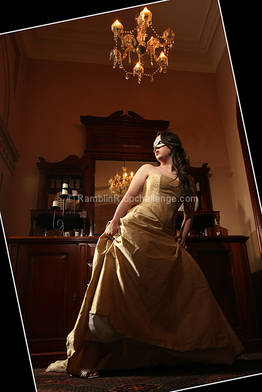
Shot this blind with the camera on the ground. OK OK the 40d does have live view but oops forgot about that at the time!! Love how this turned out. I even love the quirky boarder - I think it ads to the shot but that's just me. Hope you like it.
[Jan. 26th, 2010 04:42:10 PM]
Scoring a bit lower than I had hoped. Lots of comments for and against the boarder. The boarder was born out of necessity as the image was on too much of an angle due to being shot blind from the floor.
Statistics
Place: 273 out of 445 Avg (all users): 5.6082 Avg (commenters): 6.5833 Avg (participants): 5.6410 Avg (non-participants): 5.4800 Views since voting: 1074 Views during voting: 477 Votes: 245 Comments: 29 Favorites: 2 (view)
Count me as one that liked the shot, but didn't care for the border. :) still gave it a 7 but likely would have given and 8 without the border. One flash only? and was it modified at all?
I liked the way you used the frame, it's something I will have to remember when needed. I have found however, that most of the time when I use a border on an entry, someone will not like it's usage. Never gotten a critique for lacking one, though.
This was an 8 for me, btw. I think it was severely underrated by many. That's how it goes, I guess.
I absolutely voted in the majority for this.. :) I hated and loved the frame all at the same moment. I definitely suspected it was born from necessity.
So, what's the story behind this image? I'm curious, it's such an interesting image.
The border on this one spoils this shot for me. It's a good shot, but the border is just a major distraction... and I'm usually a bit partial to a good border...
The image itself, trying to ignore the border, is good. Detail and colour are good. The subject looks uncomfortable and looks poorly posed, rather than "fleeing". Also, find the chandelier a bit of a distraction... but even with these minor issues, I think the biggest thing that is going to hurt this in voting is THAT BORDER!
Just re-read this before hitting the "Add Comment" button and it might come off a bit harsh. Sorry... I actually quite like the photo, it's just this could have been great if not for a few little issue (which I've hopefully pointed out).
I like the shot, but I don't particularly like the framing you've added. On the other hand, if it had been an actual large wooden frame, that would be a very different matter!
totally funky how you did the picture and the border...it's really cool...I hope you will share how you did this...excellent lighting, great focus the angles (multiple ones) really add to the interest of this shot...well done!!!
this would be soooo much better without the gimmicky frame. it's essentially a nicely lit and composed shot ruined by that rubbish tilted frame. Just my opinion of course but it's annoying as the photo looks good so I'm not sure why you would have done that.
What the hell kind of border is that???? Don't get me wrong, that's very creative, and kinda seems to work on this image, but at the very least I would have liked the white line to be much smaller, ie. 1-1.5 pixels.. Your subject here is fairly interesting, I would certainly like to know more, exposure is well done, with no overexposed areas, and good detail in the shadows..
The angled frame really makes this interesting to me. The photograph itself is interesting in content and your done a beautiful job on lighting and focus. The shoe or toes showing does distract me a bit. Love that the perspective lets one see floor to ceiling in an appealing way. Nicely done.
Not sure about the angled border, but it does make it stand out from the rest of the images. The little bot of a door fram or something to the right is an unnecessary distraction. Lighting though of the image is great







 Add photograph to your favorites
 Add photographer to your favorites


 Photographer found comment helpful.


