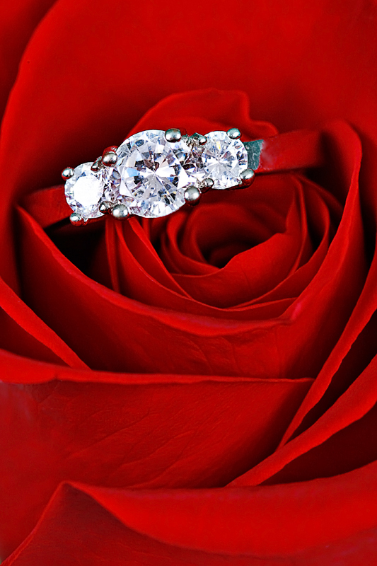
WooHoo - when I saw this one I gasped. What a combination! the bright reds of the rose and the stark blue/white of the gemstones.
There 's a lot to like in this push-pull super sharp image. It is very well photographed and elicited a large amount of commenting from our viewers. what's so much fun about the comments is that they run the gambit, so you can just pick 'n choose the ones you 'like.'
I do agree with the person who suggested that the ring shank color (most of it turned red) should have retained its original color. That is the only, well, false, note in the entire composition.
You're good and I enjoyed a peak at your portfolio. (One of the perks of this job is looking at the work of people you might not otherwise get to)
Keep up the good work and I look forward to seeing more of your images.
What a bold red background for these lovely diamonds. I think the red color has overtaken the band of the ring so it blends in. I would like to see stand out more.
lovely, could be an advert in it's composition and idea. The diamond looks a little bright though for this to be on a poster the lighting would have to be better controlled on the diamonds themselves.
YES!!! I'll marry you!!! Thought you'd never ask...(please don't run screaming from the room)....really nice picture, your rose is super, super clear and you didn't loose any of the detail in the petals...but personally the shank on the ring should have stayed silver/gold (white) rather than coloring it red...that just didn't work for me...







 Add photograph to your favorites
 Add photographer to your favorites


 Photographer found comment helpful.


