|
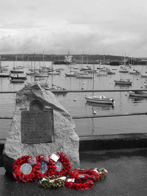
Good, original idea. The color brings you to what is "important". The focal point (the color) seems just a little too far down and to the left within the composition. It would have been very nice to have had a little more tonal range in the B & W, but have no idea if this is even possible or perhaps you wanted to keep a more "overcast" look for your subject matter. Focus is not very crisp, which will probably affect the scores you see overal. |







 Add photograph to your favorites
 Add photographer to your favorites


