First gut feeling:
The image seems to have an obtrusive element, that somehow gets in the way.
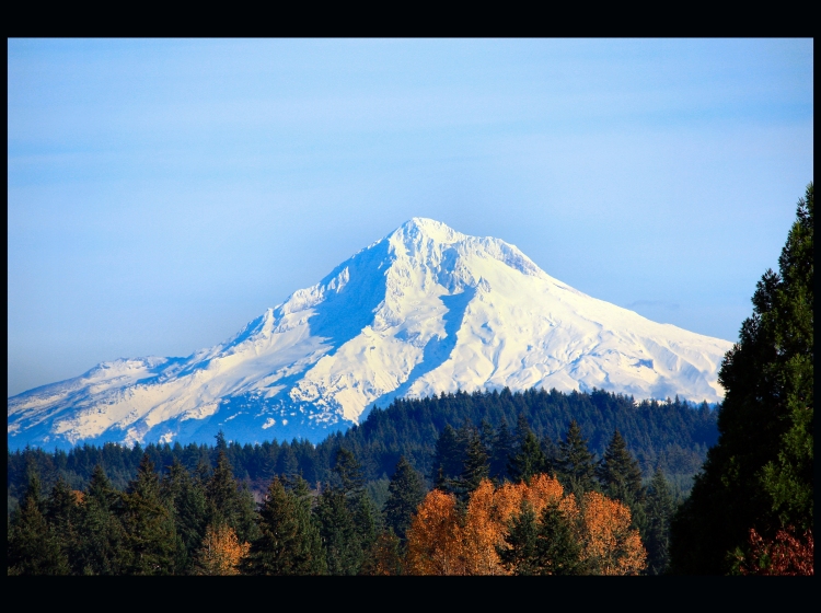
The scene is great, the levels of contrast from the closest plane to the mountain are very appealing, and the definition is very good, the focus is spot on.
Unfortunately, the tree on the leftright removes the notion that people associate with landscape to resemble a bit more like a window shot. The tree frames this shot, whereas one would like to have had a clear vision.
The border is a good idea, although if it was even the effect would be stronger.
For post processing, your tones are great, and you just need to remove the blue cast from the mountain. On way is to desaturate slightly the cyans and blues. You'll loose blue in the sky as well, but since it's advance editing you could mask it out.
Although it placed where it did, a 5,3 score is good, since this is not a comparative score, but an absolute.
Feel free to contact me if you have any questions.
This is a good shot of that majestic mountain. Mt. Hood looms in the distance. There are some nice, rich, colors in the tree canopy but the picture suffers greatly for lack of color balance in the blue/white tones on the main subject itself. Getting a perfect balance of white snow with the correct color for shadows and highlights is difficult. The shadows on the mountain is saturated in blue tones - unrealistic blue tones. Post Processing and/or bumping up the saturation most likely turned the well balanced tones overly bluish. Playing around with RGB by only lowering the Blue Channel (not too much past -5 because then you will rob your sky of blue tones unless you do a selective edit) and also Highlights/Shadows/Midtones could get it to look more natural.
I know this place very well. You hit a dandy of a clear day. Very good and you even got some color in the trees. This is really very nice. Congrats. Good work.







 Add photograph to your favorites
 Add photographer to your favorites


 Photographer found comment helpful.


