Hi, Critique Club here...
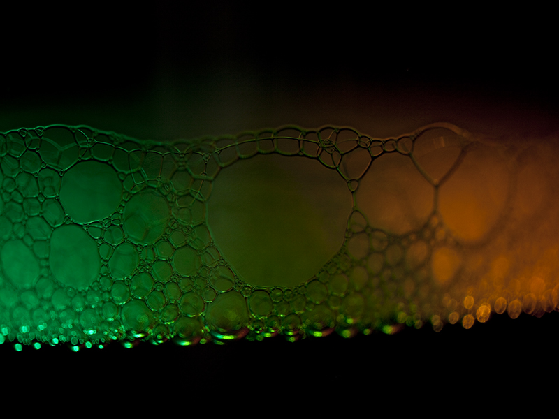
This is a difficult image to critique because it is kind of an abstract and is so subjective by nature.
But here goes.
First what I like:
I think the texture on the green side is very cool, almost reptilian with the varied shapes of the bubbles. It's sharp and the color really pops. I rather like the transition to orange as well. I like the linear line with reservations (see below)
What I'm not so keen on:
I find myself distracted by the out of focus bubbles along the bottom edge as well as the out of focus right side. I find myself wishing the lower edge of the bubbles was more of a strait line, but once again, purely a taste thing. I'm not particularly keen on all the darkness at the top and bottom and think the image should be cropped tighter - top, bottom, and from the right side. As is, there really isn't a place for my eye to focus, it's kind of all over the place. I might play with the diagonal idea that one commenter pointed out, that might make a more dynamic presentation.
I hope this is somewhat helpful.
|





 Add photograph to your favorites
 Add photographer to your favorites


