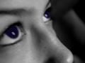
This is a really cool picture - great colors, focus, and effects. But too many colors all over the shot for me to consider this a desaturated picture. If the purple aspects were greyscalled it would have been a winner........ probably wouldn't have looked as nice as it does now, but, it would have 'fit' the challenge better. Small sacrifice to pay for winning. Frammed and matted - this picture would sell.
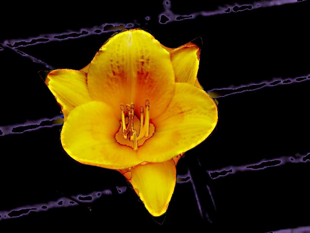
This looks weirdly over-manipulated on my monitor. There is an odd solarized or posterized effect running across the black background like it may have been a wire fence? The edges of the flower look posterized also. I'm not sure if this was the intention. It looks very weird.
I like the colors and the background interplay. The flower looks somewhat detached and floating, however. The background doesn't appear de-saturated, but more like a digital art type thing -- but of course, I don't know what I am actually seeing -- just how it "looks". The pistals in the flower show sharp outlines, as does parts of the flower, making it appear a little harsh. The shape of the flower itself and the placement aren't "great", but just an opinion. I like the hints of tangerine very much.





 Add photograph to your favorites
 Add photographer to your favorites

 Photographer found comment helpful.


