I'm on record as saying that a selective desaturation challenge would be my worst nightmare: but in a true dpc spirit I've set myself the task of learning about it, and here's my result. It seemed to me that the really useful purpose of the technique is entirely to do with emphasising a colour - so choose an object/collection of objects where the colour is an essential part of our understanding of it.
I set out to photograph London Buses, or perhaps telephone boxes, and I chose the City of London on a Saturday as I wanted the urban theme and it would be quiet and relatively traffic free, though the buses would still be running. I did get a couple of bus shots, but the adverts all over them ruin things, and I also got a couple of phone box shots, but they feel a touch obvious to a Londoner.
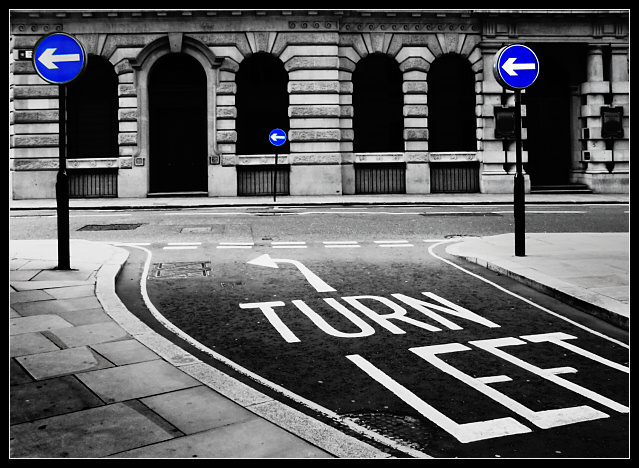
Then I saw this. The selective de-sat here actually serves to isolate these signs from their background, to give them punch, and to add to the effect of the road markings. I quite like it, though I will say that the technique still feels a little like cheating.
A lot of work here; couldn't get far enough away, so had to shoot wide-angle, but I wanted the geometry to work, so have perspective corrected this. Then had to stretch it a touch to get the circular signs round again. Pure desaturation left the buildings looking blue, so I selected the signs and boosted the saturation there, then inverted that selection and completely desaturated the rest of the image, and then used curves and levels to bring out the shadows. Returning to the signs, I balanced the brightness of them individually. A touch of burning and selective brightening and upping of contrast elsewhere to give the high contrast impact, and here you go.
Statistics
Place: 9 out of 227 Avg (all users): 6.5294 Avg (commenters): 8.3684 Avg (participants): 6.5952 Avg (non-participants): 6.4231 Views since voting: 3032 Votes: 204 Comments: 31 Favorites: 21 (view)
This gets my top vote for the Blue Ribbon. Aside from the slightly blown out highlights in the street this is about as perfect an image as you can get for this challenge. I'd give this an 11 if I could.
I love the richness of this. The bold blue brings a modern feel to the old style architecture. You've got a good eye to be able to see these elements as a pleasing photograph with the intention of desaturating like this. Bravo!!! 10
This shot is just toooo cool, I absoulutely love it, I will be mad if this doesnt get a ribbon, the is nothing wrong with this, its just the way its supposed to be, So all I can say is good luck :) - 10
The print quality is right on. Bright crisp whites and dark blacks - with plenty of tonal range between. Everything else works too - focus, composition, and the desaturization. If it were mine - I would not use the white line as part of the border.
Very good picture to use on this Challenge. Crop is too tight on the top for my taste. Colors and dof are nice, contrast seems a bit much, or, was the original a bit dark? Either way - a very good job. Rated 8.
Nice use of the theme (it has a purpose!!) and there's some humour too. Blue is just too saturated though and would look more slick with a bit more subtlety. In this instance I feel that no border would have been more simple and emphatic of the technique.
Great work!! I love the primary colour blue in your photograph, it really stands out well. I also like the composition, choice and 'colour' in your shot. Excellent work and well done.





 Add photograph to your favorites
 Add photographer to your favorites

 Photographer found comment helpful.


