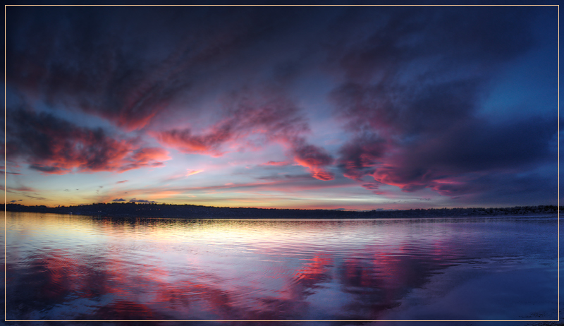
Photographer’s Notes This is in the style of my December 2009 Free Study entry, but toned down a bit so as not to push voters beyond their comfort zone.
In fact, looking back over nearly 200 challenge entries, I am not sure I have a signature style. So this will do as well an anything.
The title is in homage to the book and movie, 2010: Odyssey Two, by Arthur Clarke. We are in 2010 after all, but we won't be going to (or back to) Jupiter any time soon. More's the pity!
Post Processing • Composite 7 RAW Images to HDR (Photomatix)
• Tone Map Realisticly (Photomatix)
• Tone Map Separately Cartoonly (Photomatix)
• Auto-Blend (PSCS4)
• Crop
• Blur (PSCS4 Gausian Blur & Mask)
• Boost Contrast (PSCS4 Curves Layer)
• Modify Contrast (PSCS4 Hue/Sat Layer)
• Resize (Genuine Fractals)
• Sharpen (PSCS4 USM)
• Border (Stroke Layer)
• Save for Web (PSCS4)
Camera Data • Date: 2009-01-09
• Camera: Nikon D3
• Lens: Nikon AF Fisheye-Nikkor 16mm f/2.8D
• ISO: 800
• Aperture: f/5.6
• Shutter: Various
Statistics
Place: 25 out of 193 Avg (all users): 6.3934 Avg (commenters): 7.7778 Avg (participants): 6.2763 Avg (non-participants): 6.4593 Views since voting: 2371 Views during voting: 415 Votes: 211 Comments: 11 Favorites: 2 (view)
Well, you finished very, very well in this tough challenge, so there isn't really much of anything to 'critique' in this image of yours.
The colors are in balance, the composition is well done and the frame is 'just enough' without being obtrusive. The title fits (and yes I have read the book) so all in all, I can only say "nice job" and move on to the next image in the queue.
Holy smokes. This is gorgeous. I love that the land is thin, making the sky and water look much more expansive. I'm sure this doesn't even do the real scene justice. You are so lucky to have been able to experience this!
Beautiful. Exquisite. If you could have tilted the lens down just a tad to catch all the red reflection it would have been best but that is the only criticism I have.





 See how this photograph was created!
 Add photograph to your favorites
 Add photographer to your favorites

 Photographer found comment helpful.


