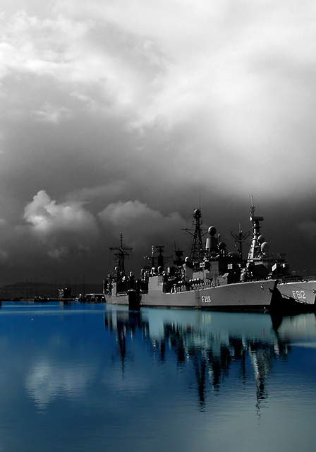
Several naval vessels docked at Leith (N. of Edinburgh)for rest during ?NATO manoevres. Picture cropped and colour image increased for contrast and saturation. Duplicate layer created, desaturated, curves applied to enhance sky. Water region deleted to allow colour layer to show through. Image flattened and passed through NeatImage to clean up sky (but should have passed colour layer through independently as blue noise not removed very well).
Statistics
Place: 2 out of 227 Avg (all users): 6.8660 Avg (commenters): 8.4667 Avg (participants): 6.8189 Avg (non-participants): 6.9390 Views since voting: 11552 Votes: 209 Comments: 67 Favorites: 55 (view)
This is absolutely beautiful and I love the color. I do not see the noise you mention in the comments. Looks just perfect to me. Could it be that you are a perfectionist? Good! Bobbie
Very cool picture. An unusual use of selective desat, a way I would never thought to use. Love the juxtaposition of colored water and gray sky, really draws attention to the ships, which lie just in the center. Very creative and original, well done!
Thanks for all the comments...much appreciated. Congrats also to Gordon and Laurie for their well-deserved ribbons. I shall now retire to low 5 scores where I feel much more comfortable! Away for a few weeks now in Slovenia...hope to bring back some good pix. Thanks again and bye!!
Wow! That is the first thing that came to mind when I looked at your image. It is breathtaking!
Congratulations on your first ribbon - you earned it and them some!
I've looked at this one several times this week. I really like the blues in the reflection. The angle is nice; very effective. One tiny nitpick is the back end of the ship right past the "812" is cut off, but that's tiny. Very well done. :o)
This shot is truly amazing the sky looks good, I think it could have been a little darker though, the ship looks awesome and the reflection, the blue color is great, I would be a fool if I would give this less than a 10, Good luck :)
I love this photo! Strong contrast, the lighting, the emotion.. very powerful. Excellent choice to leave the reflection in color, almost leaves you wondering which is reality. You should score highly with this photo, my pick for top3.
very nice entry, good depth of field; I wish the background was just a bit lighter in the area rigth above the ships, the superstructure loses definition there by blending into the background
I love the title and subject. The sky is very dramatic and it may have been nice to see a little more contrast between the ship's towers and the sky. Possibly some dodging or levels adjustment in Pshop? ..... 7
Something about this bugs me, but I'm not sure what it is. I think, that its the blue. I dunno though. I think this would be an awesome photo in color or black and white, not a mixture. 5.
Excellent shot and lends itself to the effect nicely.
ok, I'm clutching at straws here but feel the blue of the water maybe makes this a little more surreal than I'd have liked. The title really lends itself to this picture. Calling out for a print (but I guess you know this :)
Great! I really like this one. The composition is very nice. Placing the horizon on the lower third was a good choice here. The big, desaturated sky works well with the main subject. Excellent work! A big 10 from me.
I really like your take on the challenge. It seems very original to me and it is quite a breathtaking shot. The water looks amazing and really stands out against the B&W background. One of my favorites of the challenge!






 Battleship grey
 Add photograph to your favorites
 Add photographer to your favorites

 Photographer found comment helpful.


