Composition:
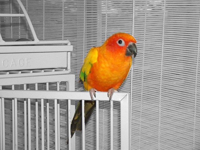
This is a good choice for this challenge, the colors are vibrant and lush. Your framing is very much centered, while it can work sometimes, in this case there just isn't enough going on in the photo to keep my interest. You look at it, say okay, this is a brightly colored bird, and that's it. It just leaves you hanging there. I'm not sure what would make it more interesting. Perhaps having the bird sitting on a finger instead, That would really bring out the fact that only the bird is in color. As it is, the cage and blinds are very sterile, and not very colorful. Having a colorful background will really drive the point home that only the bird is in color.
Lighting:
Your lighting is fine in the photo. The exposure is spot on and that's good.
Technical:
Your depth of field is fairly high, it could be a bit lower to soften the background, such as the window blinds.
Post-Processing:
Your desaturation technique is a little harsh, softening the transition would've helped. Right now it's bam! in your face trasition.
Overall:
The biggest problems with this photo is the fact that there's nothing there to keep your attention. Just having bright colors isn't always going to keep your viewer interested. I really think a different background etc would've helped your photo tremendously. Also using a bigger aperture would've softened your background. It has potential, but your delivery needs a little work to really cash in on that.
Good try, and I look forward to future submissions.
Great contrast and very vivid colors! My only suggestion is that the lighting seems a little harsh and the cropping of the bird to desaturate is a little messy.... particularly around the wings.
I love the colors, and the background works well in black and white. I think some feathering (no pun intended) at the border between bird and background would avoid the flat "pasted in" look.
Appears to be a touch oversharpened OR you maybe needed to feather your selection of the bird to make the transition not so harsh OR a combo of both.
TC
Perfect colors to really pop in a de-sat, and you caught the bird's eye really well. The background/B&W portion looks a little washed out to me, and the bird has a slightly "pasted in" look, at least on my monitor.







 Add photograph to your favorites
 Add photographer to your favorites


 Photographer found comment helpful.

