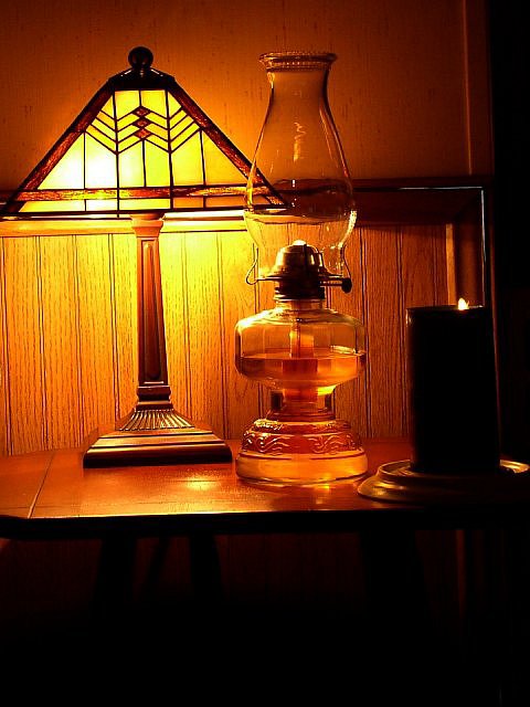
I like the look of this photo but I would have liked it a lot better if the objects were level. It looks like the camera was tipped a little when you took the photo. If the edge of the desk was parallel to the bottom border of the photo it would greatly improve. This is one detail a lot of people forget and it's the one that bothers me the most -- I'm just that way :) The second thing that would be better is if there was more light on the candle. I didn't notice it at first as being part of the grouping. It's such a good, rich photo otherwise. Please forgive the nit picker.
Nice glow to the lighting here. The candle is too obscure here...I really didn't see it at first. The composition could be cropped a little tighter to eliminate the black void under the table...it doesn't really add anything to the picture. The wire running up the right side is distracting. My suggestion would be to move to a slightly diff perspective to eliminate those elements. This really has some potential. I love the patina of the wood. I hope this is helpful. Good luck in the challenge. 5 Grayce
Tried to get too much on this table. Next time try to get some better light on the subjects. Try the order of Light in the back gas lamp in front of the light and the candle in front of the gas lamp. That would give it some type of timeline and order.
Almost missed the candle on the right. Good use of local light but need a little more of it. Should have cropped off wasted area at bottom to draw you eyes more to the subject. Maybe composition would have been better with candle on other side so it would have had more light. That might have helped the light problem. Just a suggestion. Overall like the photo. PTL I adjusted the brightness by almost 30 points. It made ever so little difference. The more I look at the pic the more I like, but I'd still like to see it on the other side. But I've added 2. Looked again and added 1 more for a 9. This picture grows on you. Great job
The background is distracting and uneven. And, unfortunately, the lamp really washes out the left side of the photo as compared to the rest. It's even kind of hard to tell that there is a candle on the right. The photo also needs to be straightened somewhat. It's leaning left.





 Add photograph to your favorites
 Add photographer to your favorites


