New resolution for 2010 , at least 50% of my submissions will be potraits style , less birds , bugs and animals for this year!!!
LOL !! I am going to watch my average drop this year
[Jan. 12th, 2010 06:39:46 PM]
This image is doing really well and I am absolutely delighted.
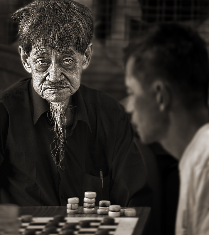
I TOTALLY AGREE with ALL the excellent & well thought out comments that I received. Totally agree that the Old Man's head seems to be pasted in floating too much. I was actually afraid that this perception would impact the score too much.
In retrospective , I should have lightened the old man's shirt more to reduce the floating effect.
On submitting the same man for both challenges , it was just pure coincidence. My intent was always to shoot for this challenge & not the Paul Simon one , but after editing a couple of the shots , I thought why waste it.
Andrew...13Jan2010
Again thanks for all the votes. It is nice to start the year like this.
Andrew...13Jan2010
Statistics
Place: 2 out of 99 Avg (all users): 6.9548 Avg (commenters): 6.7727 Avg (participants): 7.3667 Avg (non-participants): 6.8901 Views since voting: 6375 Views during voting: 463 Votes: 221 Comments: 55 Favorites: 4 (view)
Sorry for telling you this but it's not to realistic.
The picture looks interesting but when i looked at the details i had the impression that the head belongs to "another body" :P.
Wow Andrew, two ribbons on the front page from the same guy! You neded to go back and buy him lunch! Great job...you're already off to a great start in the ribbon race for 2010!!!
I gave this a 7 thinking it was James Cameron's entry. :P Seriously, as you already mentioned the head effect could have been more refined but in a way was symbolic given the narrative.
Andrew, such a strange photo... the DOF makes it appear that the large head was cut and pasted onto the background. Also, fair or not, I don't want to see this guy on the front page twice (having already seen him this week detracts somewhat from the one-in-a-billion impact), so I find myself giving this a lower score than it probably deserves. Or maybe not, I really do find it too artificial looking. :-/
Definitely a good story being told here. However, I feel like the post processing, the black shirt, and how it blends into the background sort of make it seem like his head is just floating apart from his body... and that kinda bothers me.
A great subject, but I'm not sure about the processing - it looks like the guy's head is floating away from his body, or like it's a cut and paste job (which I know it is not).
this one has kept my eye's too long..I love his expression and the composition.
overall the PP is a bit over for me,(looks like his head is hanging in the air..) yet it is a strong one. 9!
The DOF seems too narrow too me it makes his head llok like it was cut from a different picture if this was done in post process I would back it off a bit, would have given higher score but...
This image goes into my favorite. The composition is interesting, the expression, light, and tone so suitable. Did I mention that the title gives this image an additional dimension.





 The MASTER
 Add photograph to your favorites
 Add photographer to your favorites

 Photographer found comment helpful.


