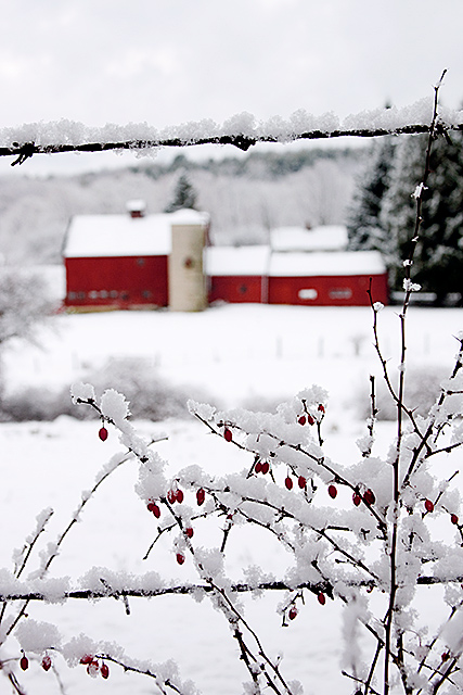
I played around with some additional layers, but didn't change things too drastically. I used the following layers: levels, curves, color balance, selective color (tweaked the red slightly), and hue/saturation (again, I changed the red slightly).
Statistics
Place: 64 out of 151 Avg (all users): 5.7464 Avg (commenters): 8.0000 Avg (participants): 5.5645 Avg (non-participants): 5.8947 Views since voting: 1038 Views during voting: 242 Votes: 138 Comments: 7 Favorites: 1 (view)
I love this photo and glad that I was assigned it for a critique. My favorite aspect is the deep reds in the barn and berries. I’m assuming that you liked that as well considering your tweaking of the reds. I think you did a perfect job on the colors and the contrast is wonderful. The framing of the barn with the wire is a great compositional feature to me and the depth of field is perfect at f9.
A couple of thoughts on why this didn’t score a 6 is that it does seem to have a balance issue as lissylou mentioned it “feels” crooked. Maybe if there was a way to get square on the fence and straight on with the barn it would have been more level? Perhaps another problem is the “fit of challenge”. The processing doesn’t fit the idea of “quite” because of the reds and high contrast, and the foreground bush creates tension in the composition, again not “quite”. In my opinion voters here like “clean” compositions with no distractions in them. I think in a free study or in a “rural” challenge this would easily score 6+.
Overall this is a wonderful photo and I wouldn’t change a thing if it were mine. I gave you some possible reasons why it didn’t get a 6, but a 5.75 is a great score here at dpChallenge.
I really love this... but think it would have a bigger impact without the top wire (although I realize that you can't really do anything about it). :o)






 Add photograph to your favorites
 Add photographer to your favorites

 Photographer found comment helpful.


