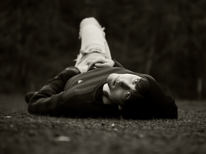
A senior portrait session I did a few weeks ago. This young man had intense eyes and a stare. Natural light only, added some contrast and a coffee filter.
Wow! What a beautiful creative pose for a guy. And what a way to fully capture those amazing eyes. Are you charging a thousand dollar sitting fee for your portrait shoots yet? I'm sure you are becoming quite famous in your parts :)
is that a tattoo or birthmark on his neck? maybe im not supposed to ask that but it just caught my attention. i am such a huge fan of shallow dof....dont know why just always liked it, and what is a coffee filter? sounds like something i would want
Hi Jason...it is a birthmark. A coffee filter is just a brown tint filter that I downloaded into Lightroom. If you have Lightroom, there are a ton of free filters you can find. Just google it!!
is that a tattoo or birthmark on his neck? maybe im not supposed to ask that but it just caught my attention. i am such a huge fan of shallow dof....dont know why just always liked it, and what is a coffee filter? sounds like something i would want
I'm going to start off my saying I love this shot, but I'm going to ask a question too. I know how hard it is to make one of these "laying on the ground" shots work, so I'm impressed to start with. The DOF is perfect and adds a lot to the shot. The lighting is wonder as well with great depth a great tonality across his face. So now I'm going to ask about the lightness of the jeans on his visible leg. The jeans are brighter than his face and draw the eye up a bit in the frame. There is nothing wrong with this, but I'm just curious if you were concerned about it or had decided it was an important element of the composition?
Wow, what an excellent and dramatic pose! Shallow (but not too shallow) DOF works great here. Regarding the slight tilt of the horizon, I think it works here, gives it a more lively feel.
STUD! hmmmm, i do love seeing senior portraits on here...
Awesome depth of field, the coffee filter you added works wonders
and i love the angle. Fantastic work
I really really love the tones and perspective. Your dof rocks on this too. The only thing I would change, for me, is to level the horizon. It seems to dip to the right which you were probably going for but I would change it cause I'm so square :-) LOL




 Add photograph to your favorites
 Add photographer to your favorites

 Photographer found comment helpful.


