-Handheld, manual mode
-Noise-reduction with PictureCooler
-RGB Curve
-Blue/Yellow Curve
-Hue/Saturation adjustments to Reds and Yellows
-Resize
-Clone out minor reflections
-USM at 66%/0.6 dia/TH = 5 (applied three times)
-SaveAs JPEG at quality 10/10 = 298KB
Statistics
Place: 326 out of 334 Avg (all users): 4.2079 Avg (commenters): 4.2500 Avg (participants): 4.1368 Avg (non-participants): 4.3443 Views since voting: 1181 Views during voting: 270 Votes: 178 Comments: 5 Favorites: 0
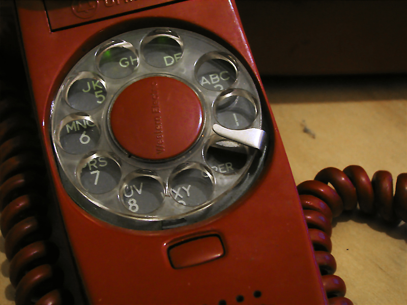
Personally, I think your processing could have added quite a bit to this in order to accentuate the retro nature of the subject. A high contrast side lit shot in BW, some grain, or an aged sepia look, would all add to the retro nature of the shot.
OK, I'm going through the Free Study submissions, purposefully finding those images I think are shot with a less conventional eye - this is one of those images! Thanks for offering something that isn't just DPC friendly eye-candy (though of course there's nothing wrong with eye-candy). I'll be picking one of these images for the Mu (most underrated) award:
Positives: The coloration is pretty good, it is a great shade of red and the green and blue highlights work well too.
Critical stuff: Everything else (sorry to be harsh) - the subject matter itself is, in my opinion, super-dull; to pull this off I think you would have needed to have made some bolder lighting, shooting and editing choices. With a really critical rant I could say 'unfocussed', 'ill-composed', 'distracting, cluttered background' but actually I don't think any of this is accidental, I think they are deliberate choices and that make me want to know more about the context.
Overall: This is a difficult image for me, in many ways it is something a 5 year old might produce with a point-and-shoot, but it isn't - this is something that has been 'seen' and chosen and offered in good faith. In the final analysis, the limitations are in my viewing; I don't get it and I don't like it but I'm guessing you do and I'm also guessing that you're a much more creative photographer than me - I'd never have the faith or commitment to stand by something as viewer-challenging as this.
I'm going to score it purely subjectively though, I know I may have missed it's merit but my vote is mine to give and I'm afraid it's a 3 from me; after all, your honesty with the image deserves an honest reaction from me.
I can appreciate this concept and I can see how the dial is off center as if it was moving. However I would have liked to see the motion blur with it as well as a stronger light source that creates drama. In other words having the light to the side and possible back a little to crate shadow appeal.






 Add photograph to your favorites
 Add photographer to your favorites


 Photographer found comment helpful.


