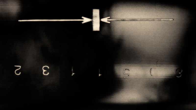
this is emblematic for one of those subliminal messages you might see in jitter edit from a horror film.
the still slaps you across your face and lets you know what it really is. oh! Canada how will we give homage to this? fabulous!
I gave it a 7. It's "artsy". I've been liking "artsy" more & more lately. It's something different to look at. Not a deeply saturated landscape (don't get me wrong, I score them well, too, when they are done well).
This is so very interesting. Love the tones and the basic subject of no subject, but maybe the numbers are the subject. :) I love artsy and unfortunately, your shot fell the way of my artsy shots, lol. How very unfortunate. I'm faving this one!!
No idea what the concept of this is. No idea what the title says much less means. All I see is an upside down image, from my perspective. That being said, I don't think this really is anything. For me it does not say anything do anything and makes no sense. I would pass by this every day and never notice it once.
No idea what the concept of this is. No idea what the title says much less means. All I see is an upside down image, from my perspective. That being said, I don't think this really is anything. For me it does not say anything do anything and makes no sense. I would pass by this every day and never notice it once.
That's a positive comment, right? Everything you wrote there, except for "all I see is an upside down image," is positive to me in this case. The fact that it doesn't smack you over the face with an obvious meaning, the fact that it doesn't really look like anything but is in fact something, the fact that the photographer has shown us something we'd never notice otherwise...
zeuszen: Great concept, great shot. So, what is it?
No idea what the concept of this is. No idea what the title says much less means. All I see is an upside down image, from my perspective. That being said, I don't think this really is anything. For me it does not say anything do anything and makes no sense. I would pass by this every day and never notice it once.
OK, I'm going through the Free Study submissions, purposefully finding those images I think are shot with a less conventional eye - this is one of those images! Thanks for offering something that isn't just DPC friendly eye-candy (though of course there's nothing wrong with eye-candy). I'll be picking one of these images for the Mu (most underrated) award:
Positives: I really, really like this - the colour and grain, the mix of focus and blur, the inverted figures, the overall mystery of the object, the play of the light on the surface - all these elements contribute to something more than the sum of the parts.
Critical stuff: Nothing at all.
Overall: DPC is a better place for entries like this, images from people who understand the difference between seeing and just framing. It won't do well, but it gets a 9 from me.







 Add photograph to your favorites
 Add photographer to your favorites

 Photographer found comment helpful.