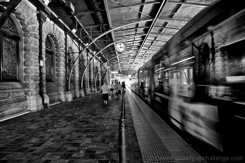
Great BW image. There's a whole lot of cool textures going on here to be looked at in greater detail. Lots of leading lines all pulling the viewer through the train station. I also really enjoy the contrast between the moving train and the seemingly static pedestrians.
The center alignment of the clock for me is distracting. I understand it is where you got your title but there is no real understanding or appeal to the average viewer as to why. At least not to this viewer. The motion of the train is interesting and I wonder if I am seeing a reflection of the other wall or seeing through the train. I think there is a lot of possible character here just it was not brought out for me.
It's like a blend of two worlds in this photo...with the crispy detail in the old station and canopy, and then the blur of the modern train. The train portion is in a hurry much like modern life, while the passengers on the station side of the photo seem to be moving at a much more leisurely pace. Great b&w tones and photo!
OK, I'm going through the Free Study submissions, purposefully finding those images I think are shot with a less conventional eye - this is one of those images! Thanks for offering something that isn't just DPC friendly eye-candy (though of course there's nothing wrong with eye-candy). I'll be picking one of these images for the Mu (most underrated) award:
Positives:This image has a crafted feel about - the care you have taken to offer the right POV is very evident. The position of the vanishing point, the right exposure time to give the 'right' amount of blur, the clarity of the clock - all very well crafted. The monochrome presentation is absolutely the right choice here too.
Critical stuff: The post processing is (I feel) a little heavy handed - perhaps it is just over-sharpened, but I think it isn't as simple as that, is it tone mapped? Whatever you have done, I like it in places - the brick on the left and the textured paving close to the track but I think it works less well on the ceiling, on the bricked flooring to the left of the pillars and on the window at the extreme left side of the image. It does depend on the software you have but there are a number of ways you could have been more selective in applying textural enhancement.
Overall: A VERY nice image, but one that (for me) doesn't make the most of the excellent composition you have crafted - over-sharpened areas distract the eye away from those leading lines you have so carefully built. Still a 7 from me, but I think there is more to be had from this capture.






 Add photograph to your favorites
 Add photographer to your favorites


 Photographer found comment helpful.


