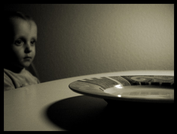
A very expressive and artful photo! I think the focus and contrast are too limited for newspaper work, however. The angle and the fancy plate do justice to the idea of the reader on one side and the child on the other--personally, I think I would have chosen a less elaborate plate to appeal to a wider group of people. I think this image would work well in a brochure--perhaps your local hunger-awareness group would be grateful for its use?
Is this meant to be a story about children going hungry. The headline is too vague for journalism. Since the photo on its own doesn't really have the feel of a journalism, it is hard to evaluate how this meets the challenge.
The plate and table are awfully prominant in relation to the child. Then there is quite a bit of negative space created by the wall. I think I get what the intention is, I'm just not sure it is working. The child is just to far off in the distance and out of focus.
Wonderful photo! But not for the headline you have. I think you could've come up with something more appropriate. (Really like the photo, just not for this challenge.)
I love this photo!!! the perspective and DOF work very well. The lighting is nice and so is the composition. My eye keeps moving through the image. I'm rivited to it. great job.






 Add photograph to your favorites
 Add photographer to your favorites


