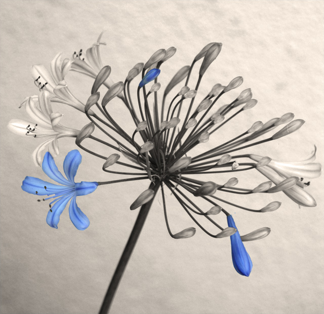
I came back to this one after calibrating my monitor. Its a very nice picture that looks more like classical art work or a nice drawing. Wonderful hue of blue too. An understated picture. Great workmanship.
This is an interesting flower and nice composition, but what does the selective desaturation do to enhance it? Is the shot better for it? Here's my thinking, if only one blossom was opened and that one blossom was colored, then it would make the selective desat important to the shot, making that blossom POP. I think as it is, with several blooms open, had you only colored the open ones and not the closed one (leaving the mostly closed ones maybe a very pale shade of blue), it would be a tad more effective. Just a observation since I can't vote and your score is not affected. Nice background and I like the sepia.






 Add photograph to your favorites
 Add photographer to your favorites

 Photographer found comment helpful.


