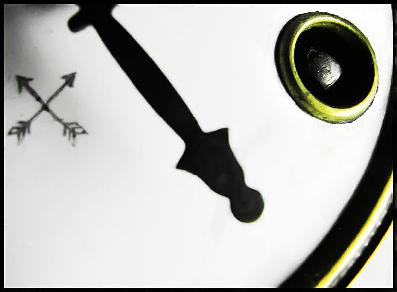
This is an old clock and a close-up of his lock (it have to be rotated by a key to give energy to the mainstream), one of his pointers and his mark.
Edition: Desaturated all the colors except yellow which i saturated and it is the original color of the lock and the other part close to the numbers. Levels. A lot of dodge&burn to get it white like this and some clone-out at black spots too, because it looked really dusty. Add border and saved it. Quite some time since my last submission, i hope you like it even with the obvious problems with the yellow and the white spots. I'm not happy with these problems but i felt like i had to submmit this.
Statistics
Place: 103 out of 137 Avg (all users): 5.1319 Avg (commenters): 5.6500 Avg (participants): 4.9589 Avg (non-participants): 5.3099 Views since voting: 735 Views during voting: 293 Votes: 144 Comments: 25 Favorites: 0
First Impression: Is that it seems oddly framed. It feels to me as though there are 3, or at least 2 main subjects competing for my attention.
Composition: As stated it seems to have competing focal points, perhaps lowering the f-stop to throw focus on just one area and blur the rest may suit this shot better. I also do not care for the crop on the bottom right. Maybe leave more of the subject in or none of it.
Lighting: Seems pretty decent. Perhaps a bit more diffused light would soften the slight glare on the right side.
For the Challenge: I think this meets the challenge well. It is a macro shot and It isn’t easy to tell what it is of so great job there. It finished probably right around where it should, I think most voters thought it was a good shot but just lacked a wow factor. It just wasn’t memorable. If I had voted on this I would likely have voted it a 5 or 6.
Overall this shot was done ok and has some good and bad technical issues. Keep up the work and keep experimenting and have fun.







 Add photograph to your favorites
 Add photographer to your favorites

 Photographer found comment helpful.


