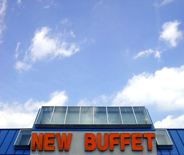
I had been just thinking that a buffet represents many choices and pulled into the parking lot and saw this sign.The red-orange of the sign looked really striking against the gorgeous blue sky and fluffy white clouds.
I cropped, resized, did a very slight adjustment of contrast and saturation in the red lettering.
Statistics
Place: 170 out of 227 Avg (all users): 4.4265 Avg (commenters): 4.6667 Avg (participants): 4.2600 Avg (non-participants): 4.5196 Views since voting: 1055 Votes: 279 Comments: 8 Favorites: 0
What the heck, I understood your photo... -_- I don't get it, what happened in this challenge? This is a great photo that should have done much better! It especially didn't deserve 10 1s and 14 2s.
Your use of negative space/clouds & sky really draws your eye to the sign (not to mention with the red of the sign as you said). And there is nothing BAD about it at all!
Sorry You didn't like my comment. I will try to be more succinct. I don't think that this represents a good choice picture since it doesn't tell the viewer what the choices are. I do like the colors and the framing of the storefront and the sky. I was not being flippant when I wrote the last comment. That is exactly what I thought you where trying to suggest. Maybe I ahve have been dieting too long. :) I certainly agree with your criticism and I will try to be more helpful from now on.
Actually, your comment was funny and not too far off. If you had followed it with, "No, seriously..." and what you said above, I would have marked is as helpful (and wouldn't have called you out in public--sorry about that--I was extremely sleep deprived at that point).
My intention was kind of a humorous elevation of the mundane kind of choices one faces at a Chinese buffet to the major life choices we make (the expanse of celestial clouds gave me that notion). I originally titled it, "Life is a buffet, choose wisely" but in my perverse way I felt that was too direct. I have an almost pathological aversion to insulting the viewer's intelligence with leading titles. Obviously, the double-meaning was too obscure and needed the clarity of a different title.
Sorry You didn't like my comment. I will try to be more succinct. I don't think that this represents a good choice picture since it doesn't tell the viewer what the choices are. I do like the colors and the framing of the storefront and the sky. I was not being flippant when I wrote the last comment. That is exactly what I thought you where trying to suggest. Maybe I ahve have been dieting too long. :) I certainly agree with your criticism and I will try to be more helpful from now on.





 Add photograph to your favorites
 Add photographer to your favorites

 Photographer found comment helpful.


